One symbol, many fractures.
The crystal mark is the only constant. Every release re-generates it with a different fracture pattern, so the brand never goes stale but also never breaks formation.
Visual identity for 柏林护士 — a Changsha-based post-punk five-piece — built around a single mutating crystal symbol and four flat inks, designed to scale from a ticket stub to a meter-tall gig poster.
Role
Brand Identity & Art Direction · No Turn on Red
Industry
Music
Deliverables
Role
Art Direction · Brand Identity · Print
For
Berlin Psycho Nurses · 柏林护士
Duration
8 weeks · ongoing
Discipline
Music branding · Underground / post-punk
Berlin Psycho Nurses · 柏林护士
A five-piece from Changsha that started by imitating their post-punk and gothic heroes, then grew into one of the loudest, most reference-rich live acts in the new Chinese underground. Their music blends post-punk, noise rock, new wave and indie rock — distorted guitars, unrelenting rhythms, and lyrics that move between gangster persona, romance, mental health, nihilism and hedonism. They broke into the mainstream with their 2023 appearance on The Big Band 3 (乐队的夏天3).

01 · Overview
Berlin Psycho Nurses (柏林护士) needed a visual identity that could carry their second-album cycle: vinyl pressings, gig posters, merch, ticket stubs, social tiles, and the live-show backdrop — all of it built on top of an aesthetic that was already loud, already coded in noise rock and new wave, already pulling from Joy Division and NEU! at the same time.
02 · Challenge
The band's music sits between two registers: a wry, gangster-persona confidence on the upbeats, and a darker, mental-health-leaning introspection underneath. The brand had to do both. It also had to scale — from a 5cm ticket stub to a four-meter projection at a Strawberry Music Festival main stage — without ever feeling stitched together. Most underground music identities in the China scene rely on borrowed Western post-punk visuals; this one had to be specific to the band.
03 · Approach
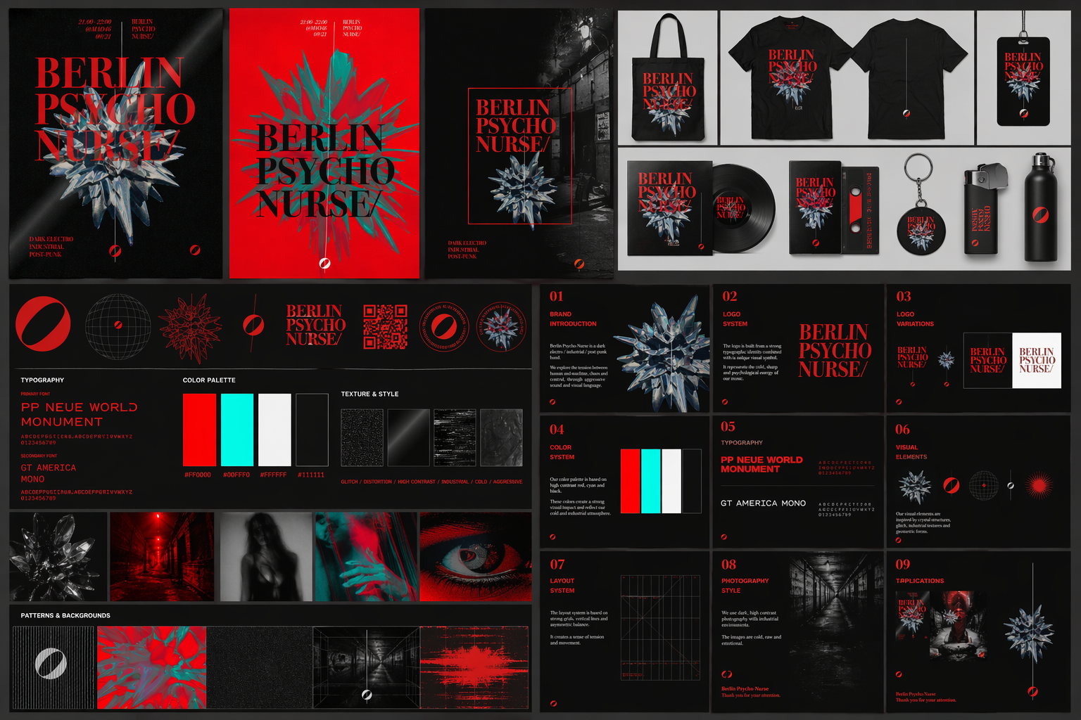
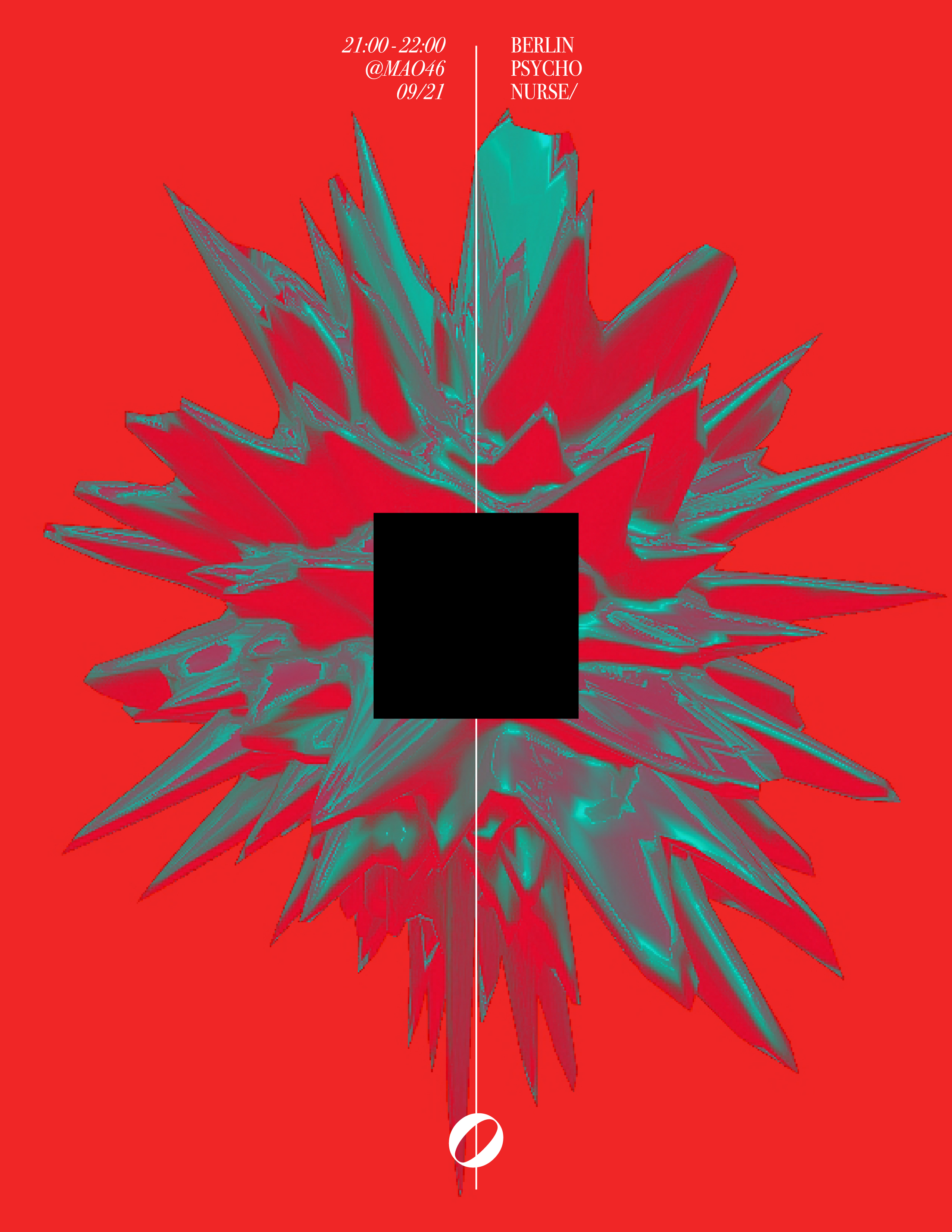
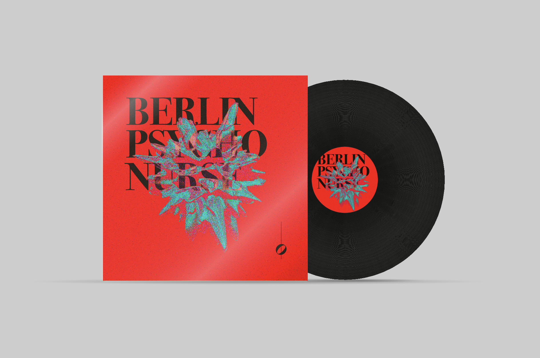
The system pivots on one element: a crystal explosion mark — half shattered glass, half medical asterisk — rendered in cyan and red, posterised to two ink colors and printed flat. It is the band's pulse. The wordmark sits behind it, gets pierced by it, gets bisected by it. Display type is set in a heavy condensed grotesque, slammed against an italic monospace caption deck. Color is non-negotiable: signal red, surgical cyan, void black, paper white. No gradients, no soft shadows. The whole brand reads photocopied even when it isn't.
04 · Outcome
A single graphic system that powers the band's gig posters, merch drops, social presence, and live-show visuals — scaled from a ticket stub up to a meter-tall poster wall without a single asset breaking. The brand has become load-bearing for every show and every release in the cycle.
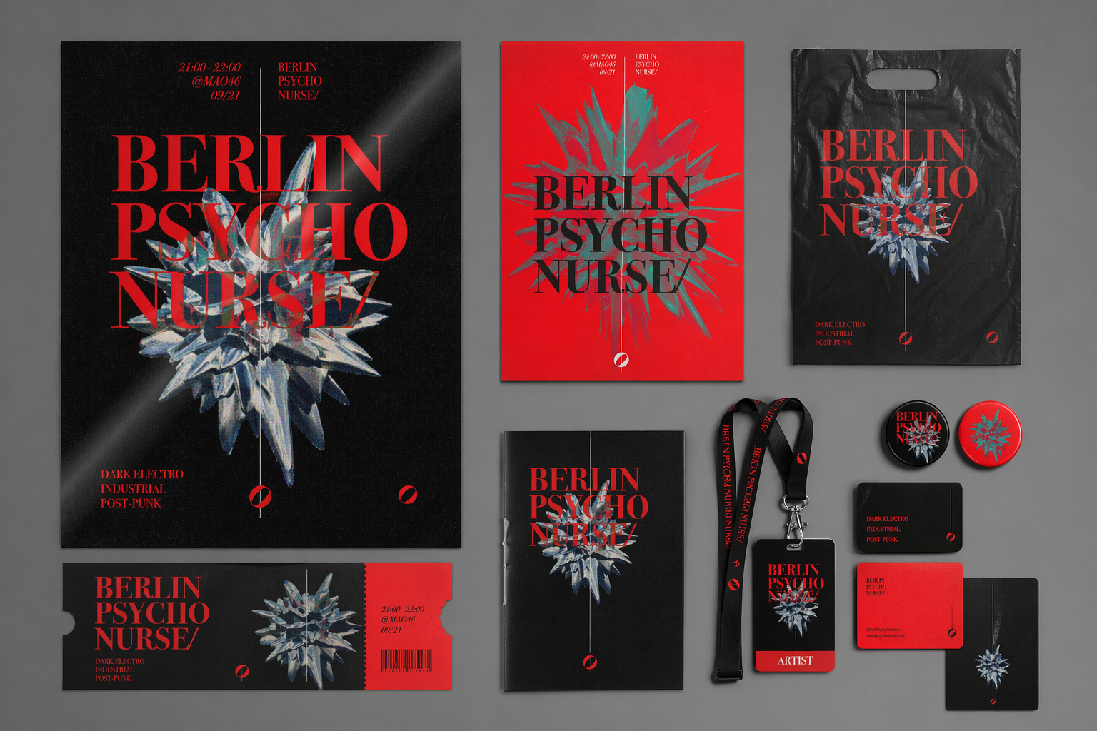
A wordmark stacked in three beats — city, mood, role — closed with a trailing slash that reads like a directory path or a setlist track-out. The slash is non-decorative; it is the band's namespace.
The crystal mark is generated as a 3D radial burst, posterised to two ink colors and printed flat. It mutates between releases — same DNA, different fracture pattern — so each show poster carries its own variant of the same symbol. Continuity through evolution.
Set in a heavy condensed grotesque, broken into three stacked lines. The wordmark is engineered to be partially obscured by the crystal mark on every release — visibility is sacrificed deliberately, the same way the band's vocals sit underneath the synths in the mix.
The crystal mark is the only constant. Every release re-generates it with a different fracture pattern, so the brand never goes stale but also never breaks formation.
Red, cyan, black, white. Anything outside the palette is treated as an error. Nothing is allowed to feel polished — flat color is the law.
The wordmark is allowed — encouraged — to be partially obscured by the mark, by other type, by the bleed. Legibility is a goal, not a tyranny.
Every artifact carries an italic monospace caption: time, venue, catalog code. The caption is the band's timestamp on the world.
Every layout is tested at 300 DPI, then re-tested at a third-generation Risograph copy. If it survives the degradation, it ships.
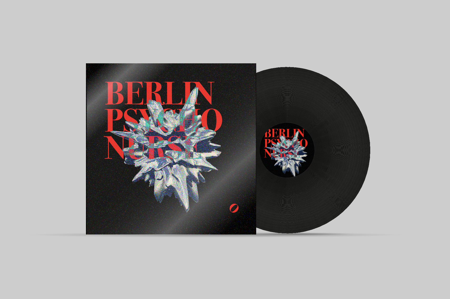
Vinyl sleeves are the source of truth. Every other surface — ticket, tote, story tile — is a derivative crop of the master sleeve artwork.
Four primaries do almost everything. Two deep tones are the only sanctioned shadows — they extend the system into long-form layouts without softening the brand. No gradients, no transparencies; everything is flat ink.
#E1252B
Signal Red
Primary · floods · poster ground
#00CFC1
Surgical Cyan
The crystal · pulse · accents
#000000
Void Black
Type · vinyl · negative space
#F2F2F2
Paper White
Counters · ticket stock · breathing room
#7A1014
Deep Red
Shadow on red · long-form depth
#0B6C66
Deep Cyan
Shadow on cyan · texture overlays
Display · wordmark
Heavy Condensed Grotesque
Three stacked lines, locked-up. Letterforms are wide enough to fight back when the crystal mark cuts through them. Always uppercase, always tight, always at maximum weight.
Captions · meta
GT America Mono Italic
Italic monospace for time stamps, venue codes, catalog numbers. Looks like a printer's receipt. Used at small sizes to date and locate every artifact.
Body · liner notes
Söhne / Neutral Grotesque
Quiet by design. Sets long-form copy on the back of sleeves, in show programs, and in the press kit without competing with the display system.
The system was designed sleeve-first. The crystal mark is sized to the 12" face; everything else (ticket stubs, social tiles, totes) is a crop taken from the master sleeve. Two pressings to date — the red 7" debut and the black 12" full-length.
Posters, flyers, ticket stubs, totes, lanyards, accreditation badges. Every piece carries the same three signals: red ground, cyan crystal, italic monospace timestamp.
The full brand-in-use grid from the guidelines deck — apparel, merchandise, vinyl variants, social tiles, environmental posters, and the anchor system pages (typography, palette, future EP, pattern and background, St. Anosika MEME).