innaRx
A biotech parent brand (innaRx) and a respiratory-therapeutics sub-brand (Inspire Rx) — two identity systems that share a scientific spine but speak to their own patient worlds.
- Category
- Branding, Web Design
- Year
- 2025
- Services
- Brand Identity, Sub-brand System, Web Design
- Client
- innaRx
Role
Founder & Principal Designer · No Turn on Red
Industry
Pharma / biotech
Outcomes
innaRx.
Best-in-class oral modulators in innate immunity.
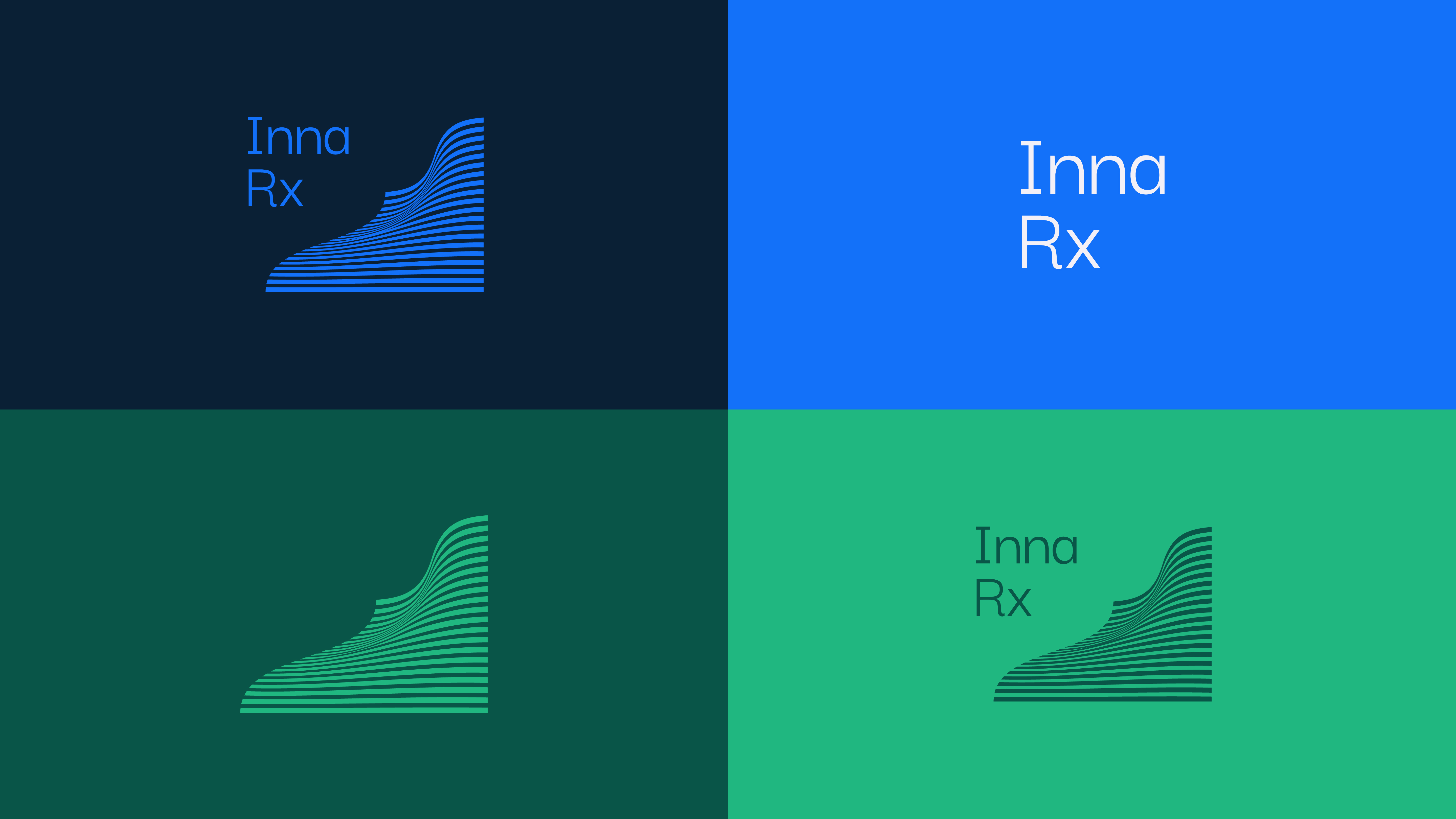
A quiet, clinical identity for a biotech solving hard problems at the innate layer of the immune system. The brand reads as a primary barrier — layered, disciplined, confident in its own chemistry — with a navy that refuses to apologize and a blue that carries the pipeline.
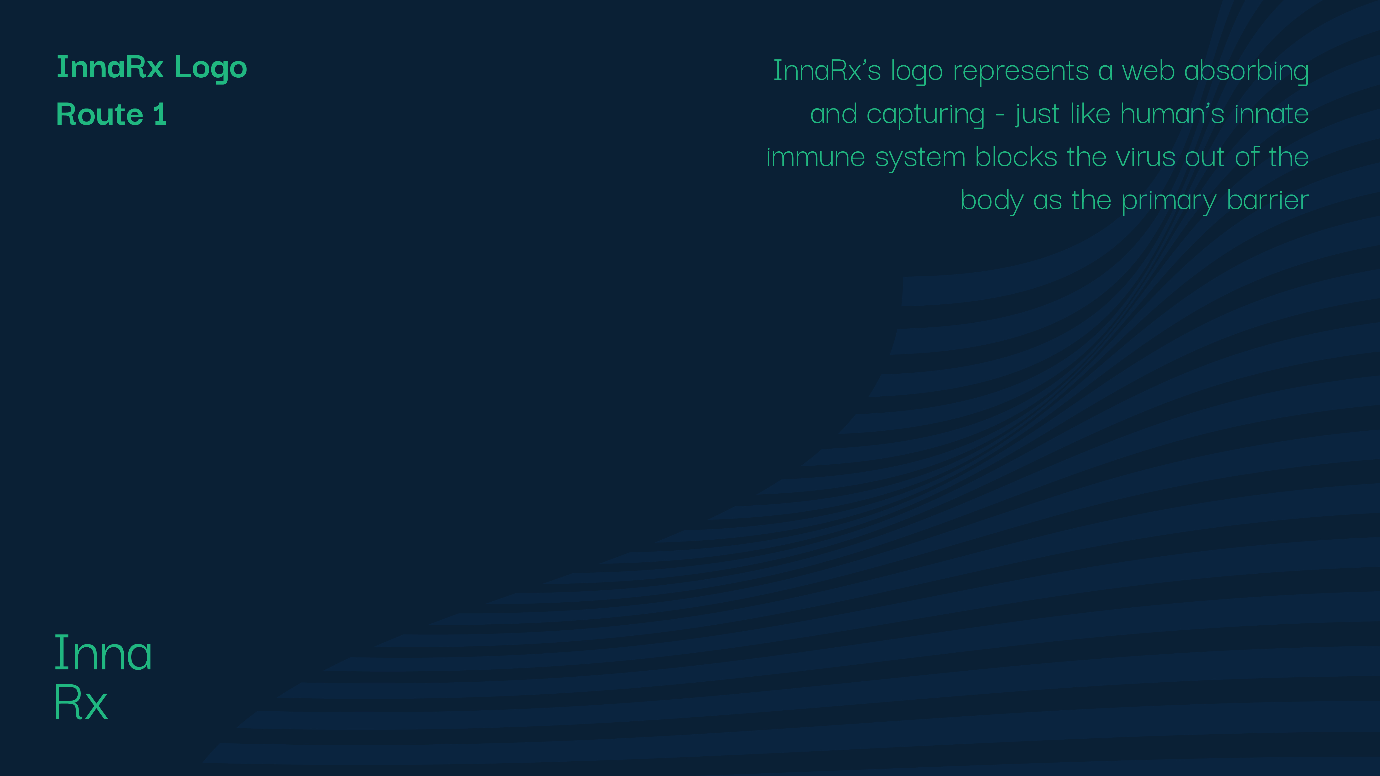
The mark abstracts the innate immune system's primary barrier — a layered web that absorbs and captures the way mucosal surfaces trap a pathogen before it reaches the interior. Horizontal strata start hard at the baseline and soften upward: science felt as a texture, not drawn as a diagram.
Deep Navy anchors the system for type and heavy surfaces. Inna Blue carries the mark and every hero moment. An off-white handles daylight. Two secondary greens only enter when copy earns them — growth, vitality, a result — never decoration.
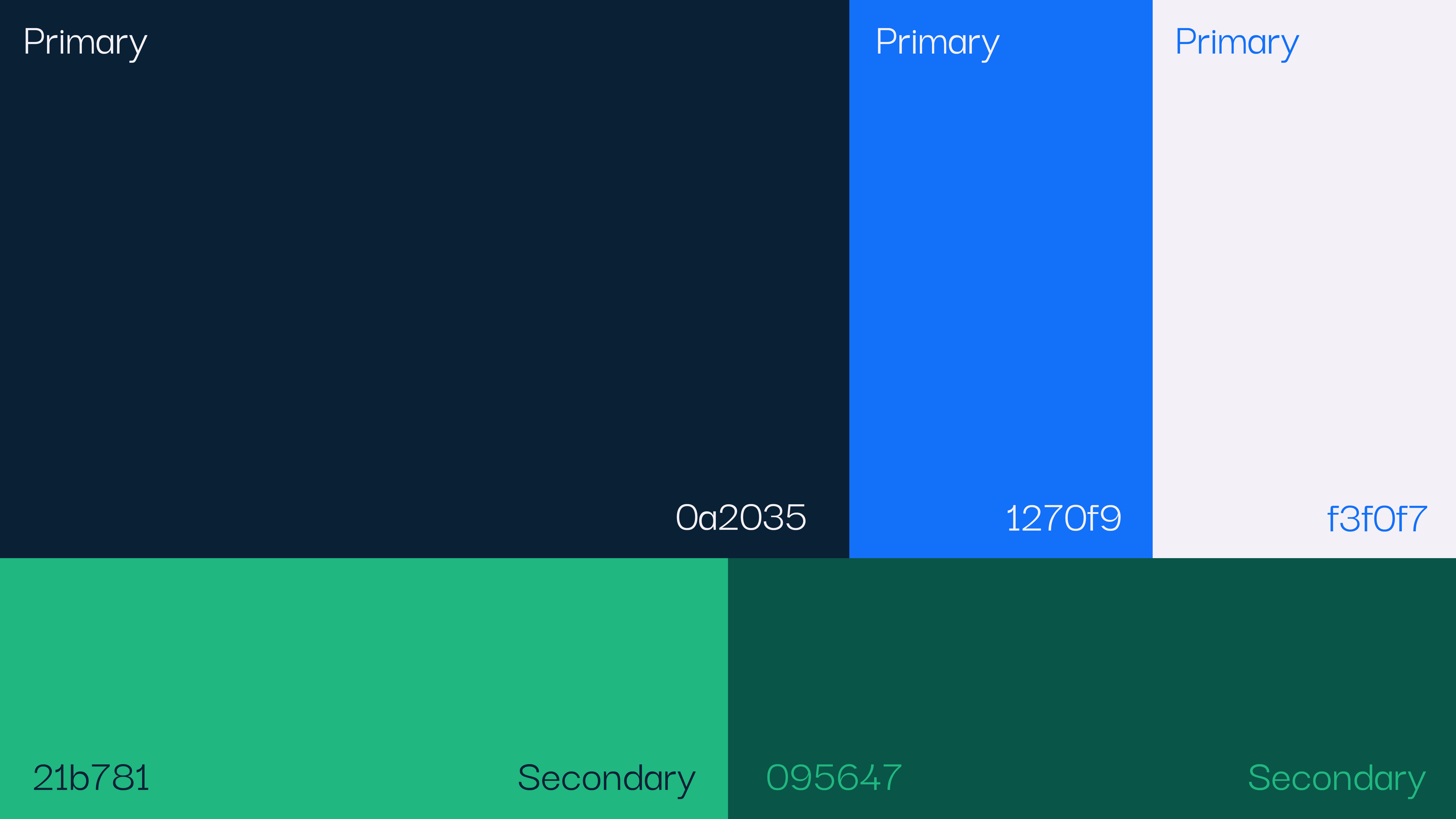
#0A2035
Deep Navy
Primary · type · backgrounds
#1270F9
Inna Blue
Primary · mark · gradient
#F3F0F7
Off-White
Primary · surfaces
#21B781
Vital Green
Secondary · accent
#095647
Deep Green
Secondary · depth
A 60 / 40 fade from Inna Blue to Deep Navy. Used behind the mark and as full-bleed hero plates — the visual equivalent of an inhaled breath resolving into focus.
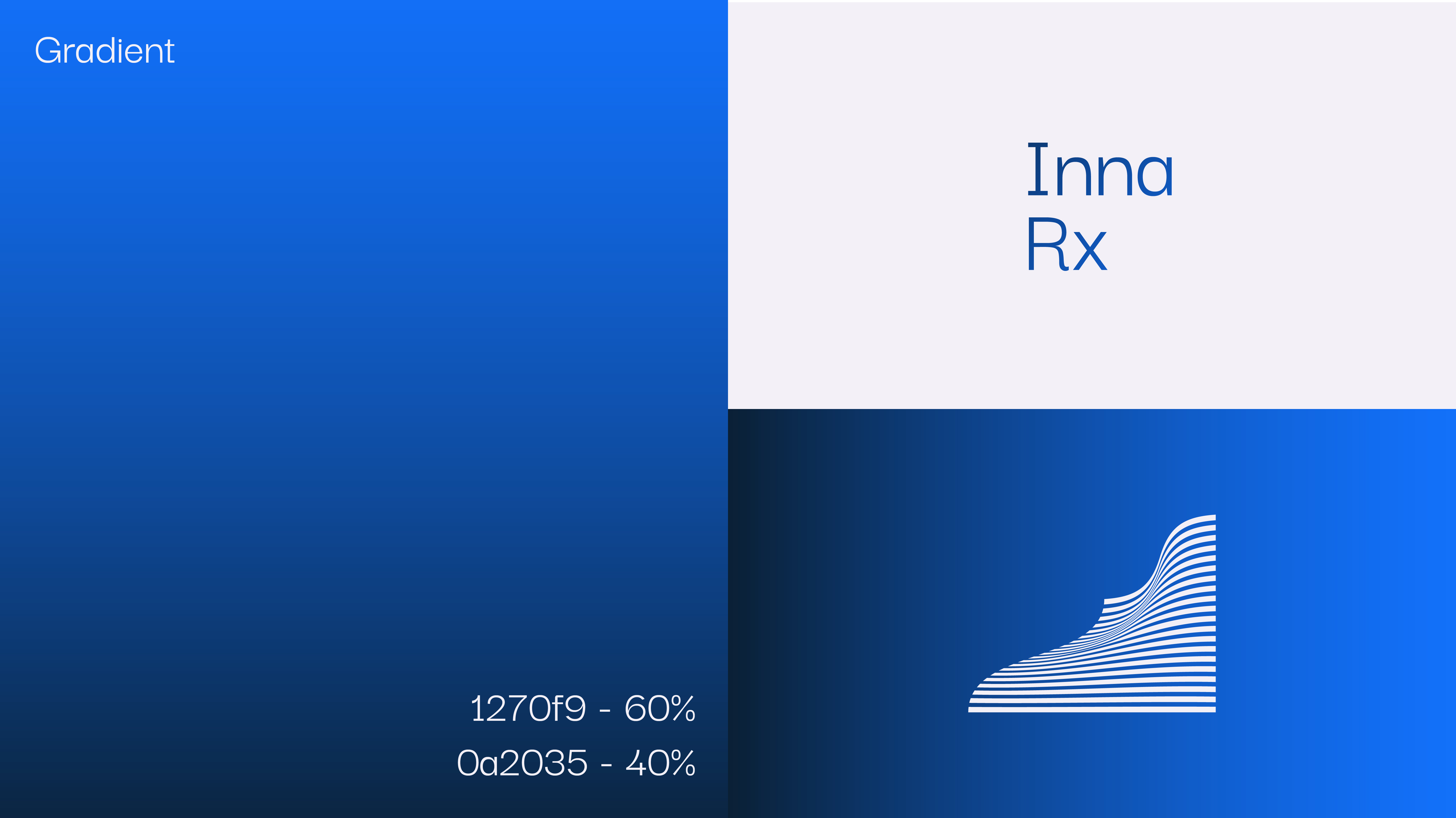
The lockup holds its shape and weight across every primary and secondary surface — navy, blue, deep green, vital green — without compromising legibility or energy.
A single-family system — Darker Grotesque at three weights. Regular handles running copy, Medium carries the wordmark and subtitles, Bold is reserved for title moments. No display faces, no flourishes: scientific claims don't need ornament, they need to be believed.
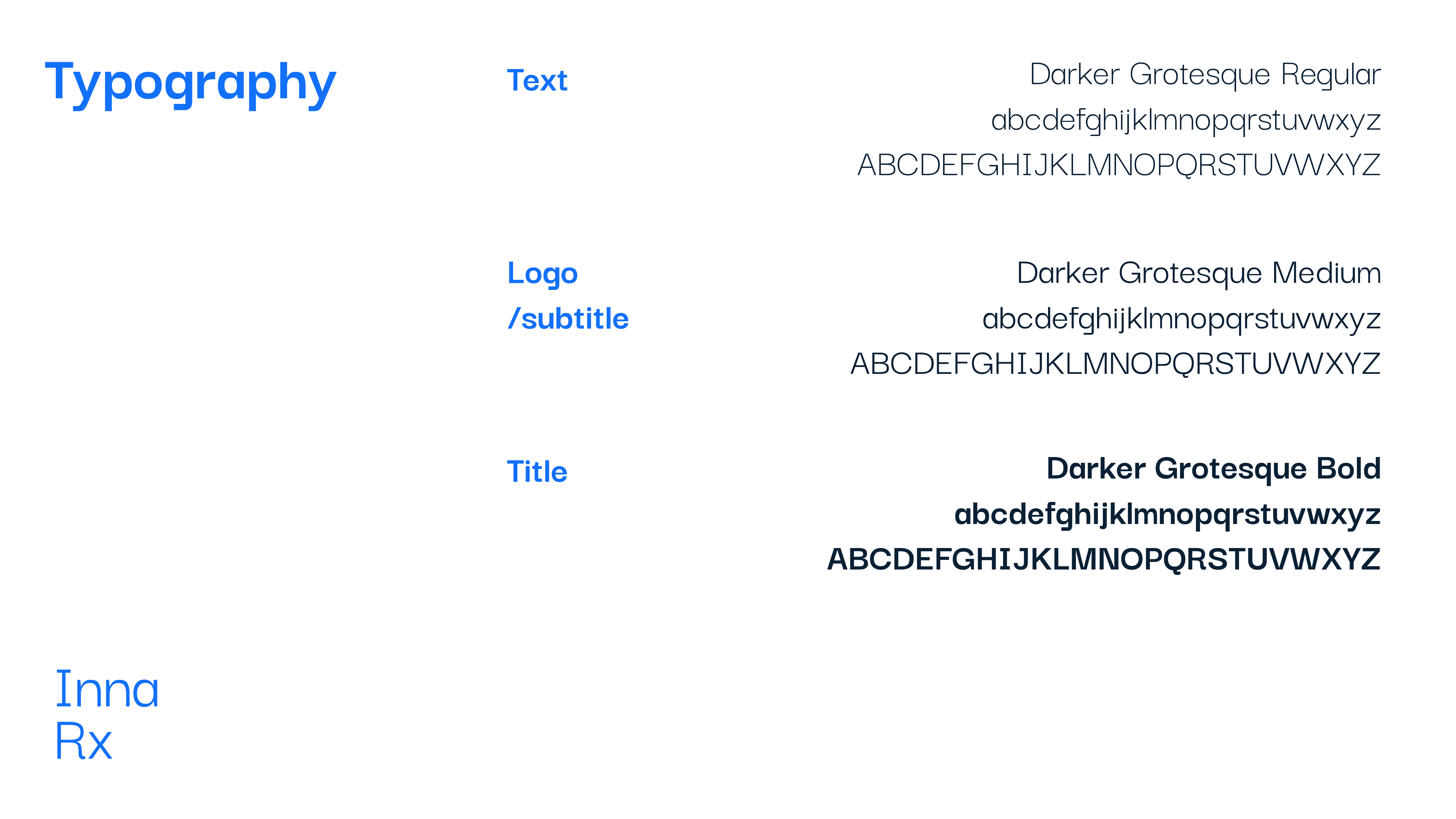
Text
Darker Grotesque
Regular — the workhorse for running copy and scientific body text.
Logo · Subtitle
Darker Grotesque
Medium — the same family, promoted for the wordmark and subheadings.
Title
Darker Grotesque
Bold — reserved for H1 hero lines and pipeline section headers.
Inspire Rx.
Breath, as treatment.
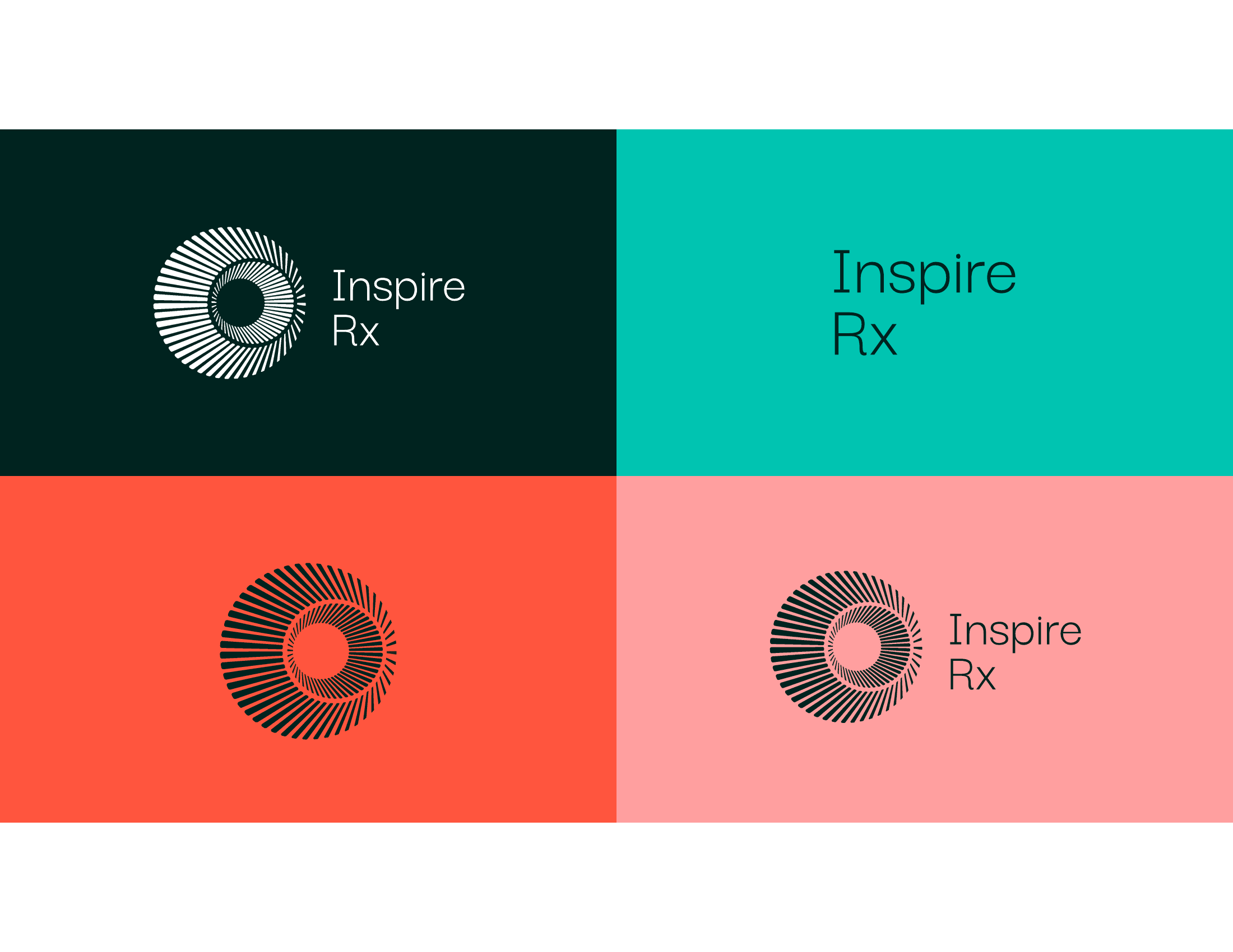
A sub-brand built for patients living with respiratory disease. Warmer than its parent, softer in voice, but visibly part of the innaRx family through a shared scientific precision. Teal where innaRx is navy — sibling, not stranger.
The horizontal lockup pairs the wormhole mark with a humane, open wordmark in Darker Grotesque. The combination reads as modern medicine — clinical where it has to be, generous everywhere else.
Inspire Teal is the primary — a single saturated hue that carries the mark and hero. Deep Forest grounds the night state and links back to innaRx without repeating its navy. Pulse Coral enters as a heat signal: a treatment taking effect, a body responding.
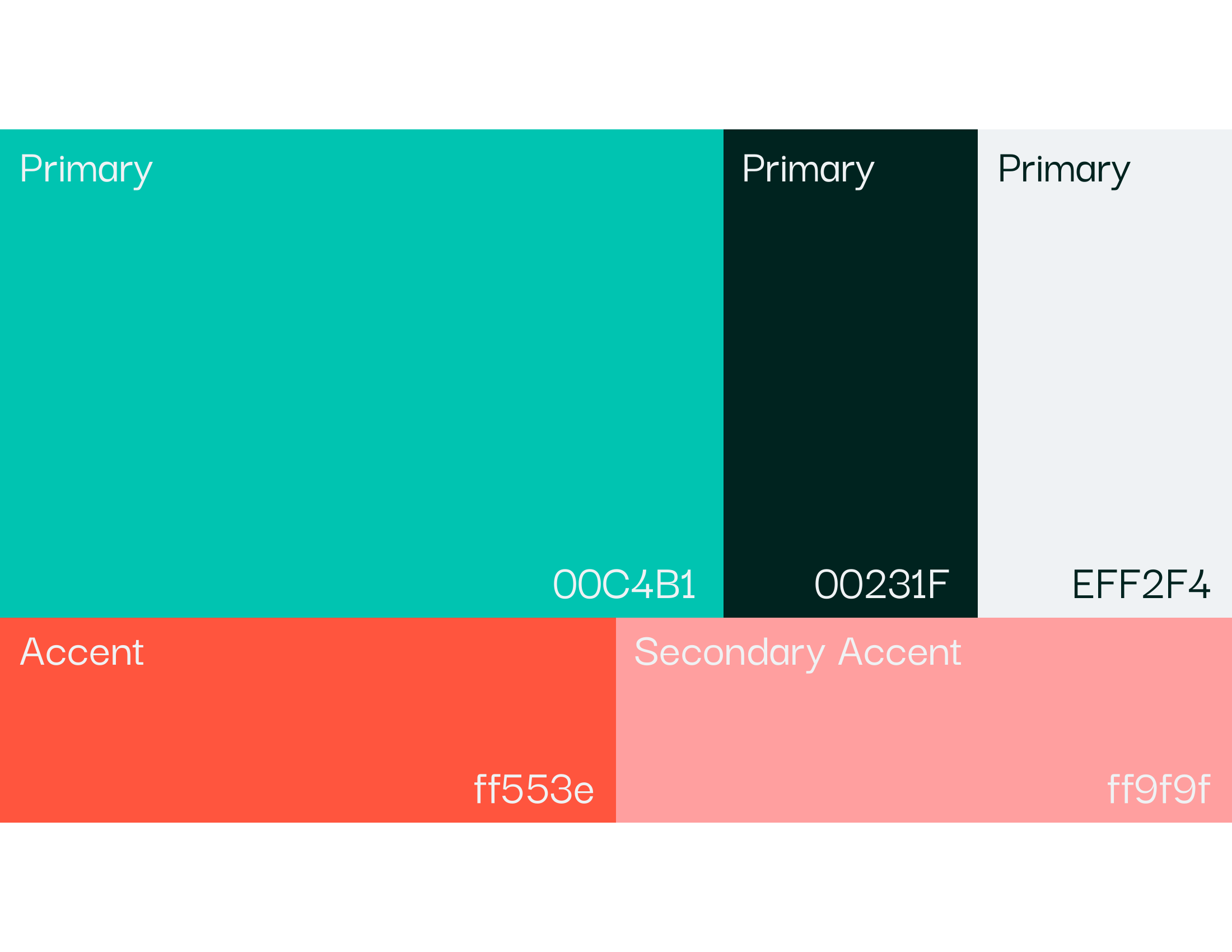
#00C4B1
Inspire Teal
Primary · mark · hero
#00231F
Deep Forest
Primary · type · night
#EFF2F4
Clinical White
Primary · surfaces
#FF553E
Pulse Coral
Accent · heat
#FF9F9F
Soft Coral
Secondary accent · skin tone
Gradients are rationed — hero plates, product moments, transitions between sections — and only ever in teal. They suggest depth and inhalation without drowning out clinical copy.
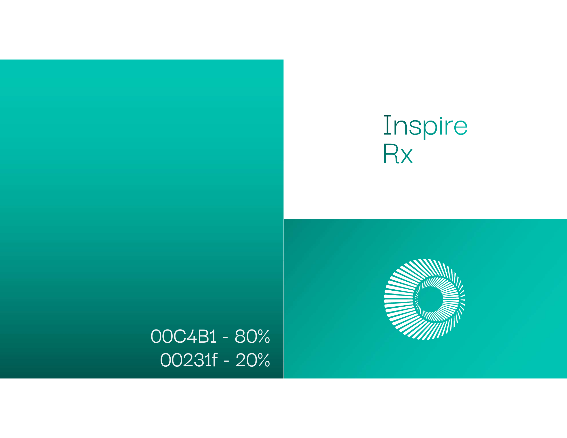
The lockup sits cleanly on four mood surfaces: forest for night, teal for daytime primary, coral for heat and attention, soft coral for skin and care. Each surface maps to a different mode of patient communication.
Poppins handles both body and hierarchy as a single family in two weights — Regular for running copy, Semibold for headings. Darker Grotesque is reserved for the wordmark: a taller, softer neighbor that keeps the brand human.
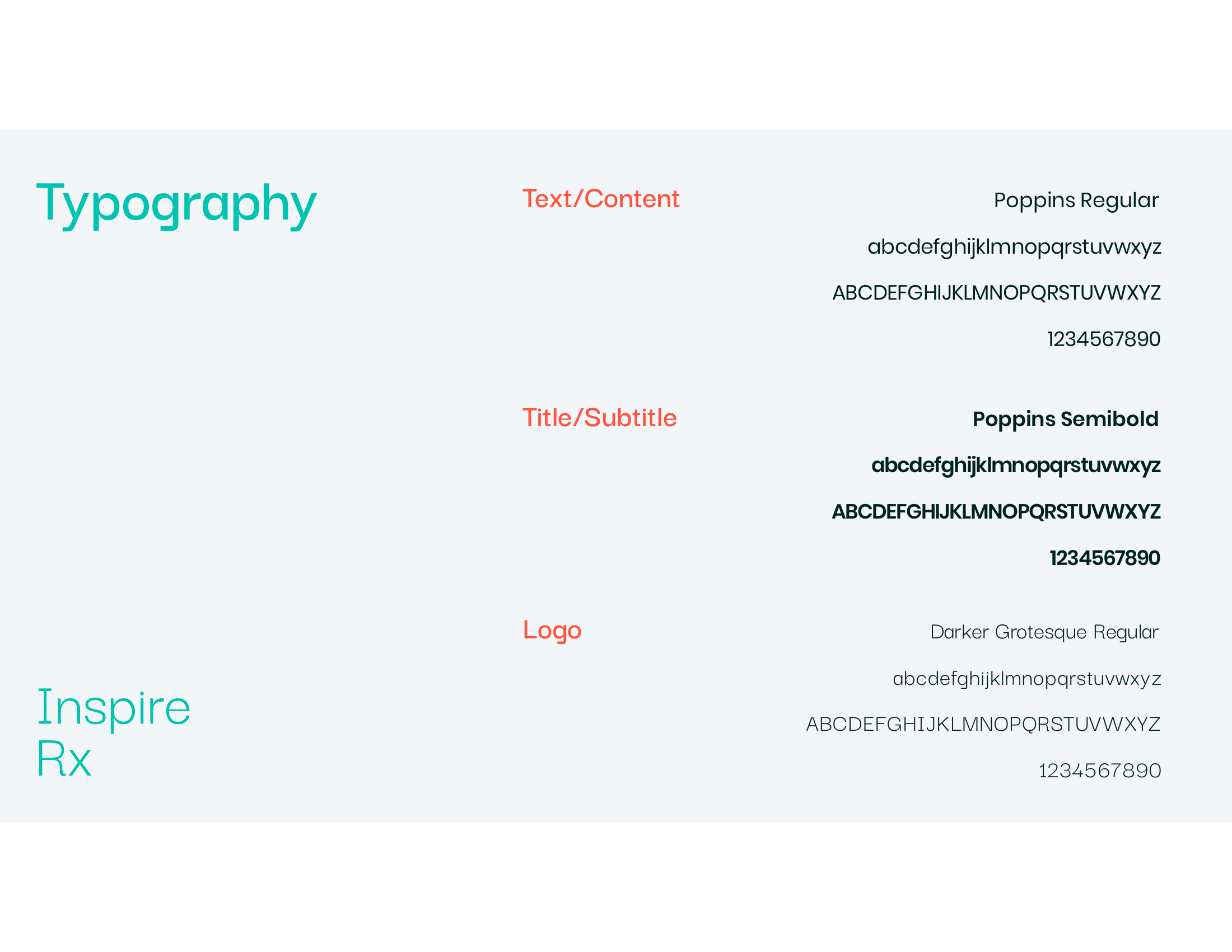
Text · Content
Poppins
Regular — neutral geometric sans for all running copy.
Title · Subtitle
Poppins
Semibold — the same family, promoted for hierarchy.
Logo
Darker Grotesque
Regular — a softer, taller sans reserved for the wordmark.
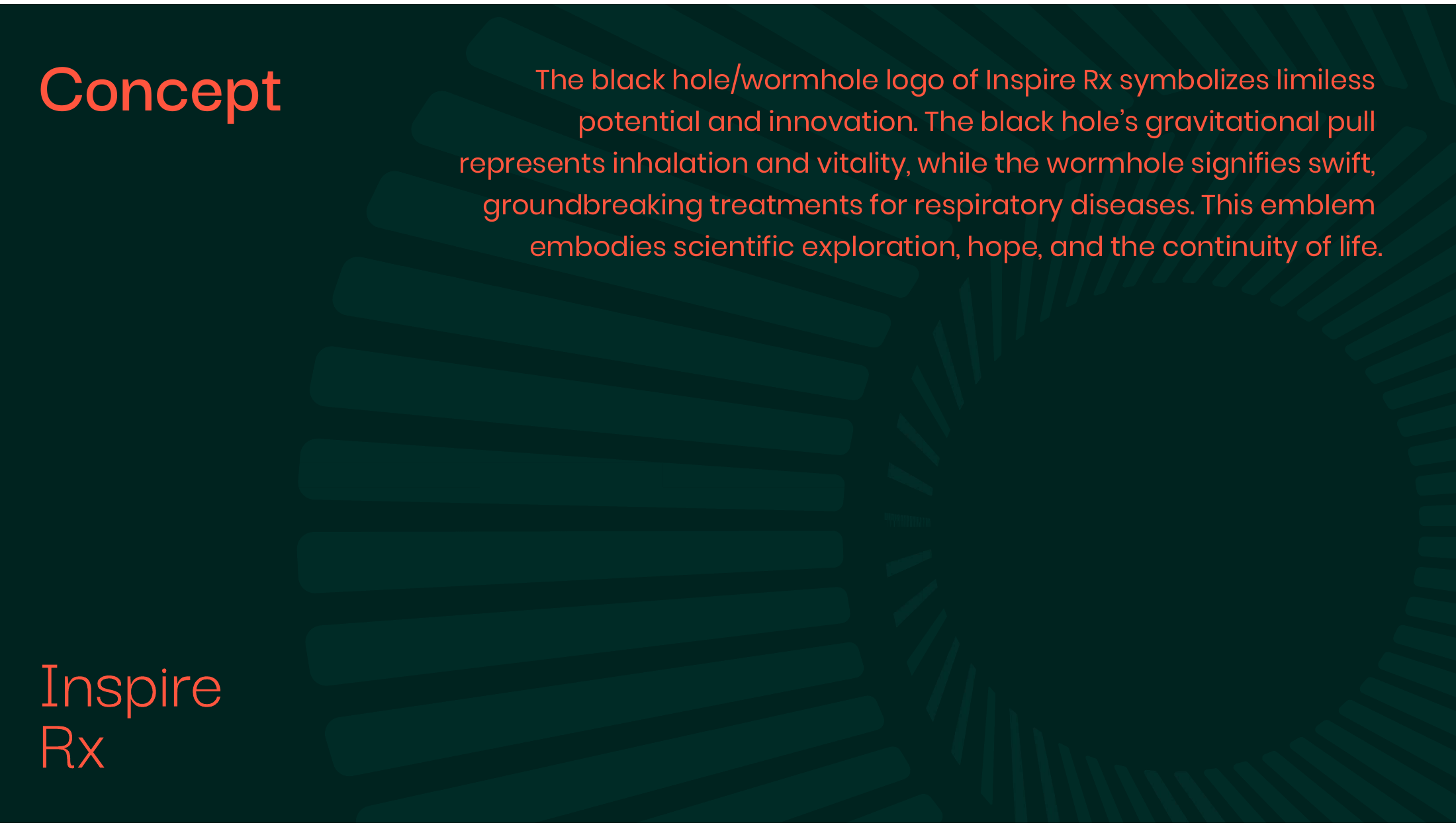
The mark is anatomy and ambition in the same gesture. A black hole's gravitational pull stands in for inhalation and vitality; the wormhole — a shortcut across spacetime — stands in for swift, groundbreaking treatment.
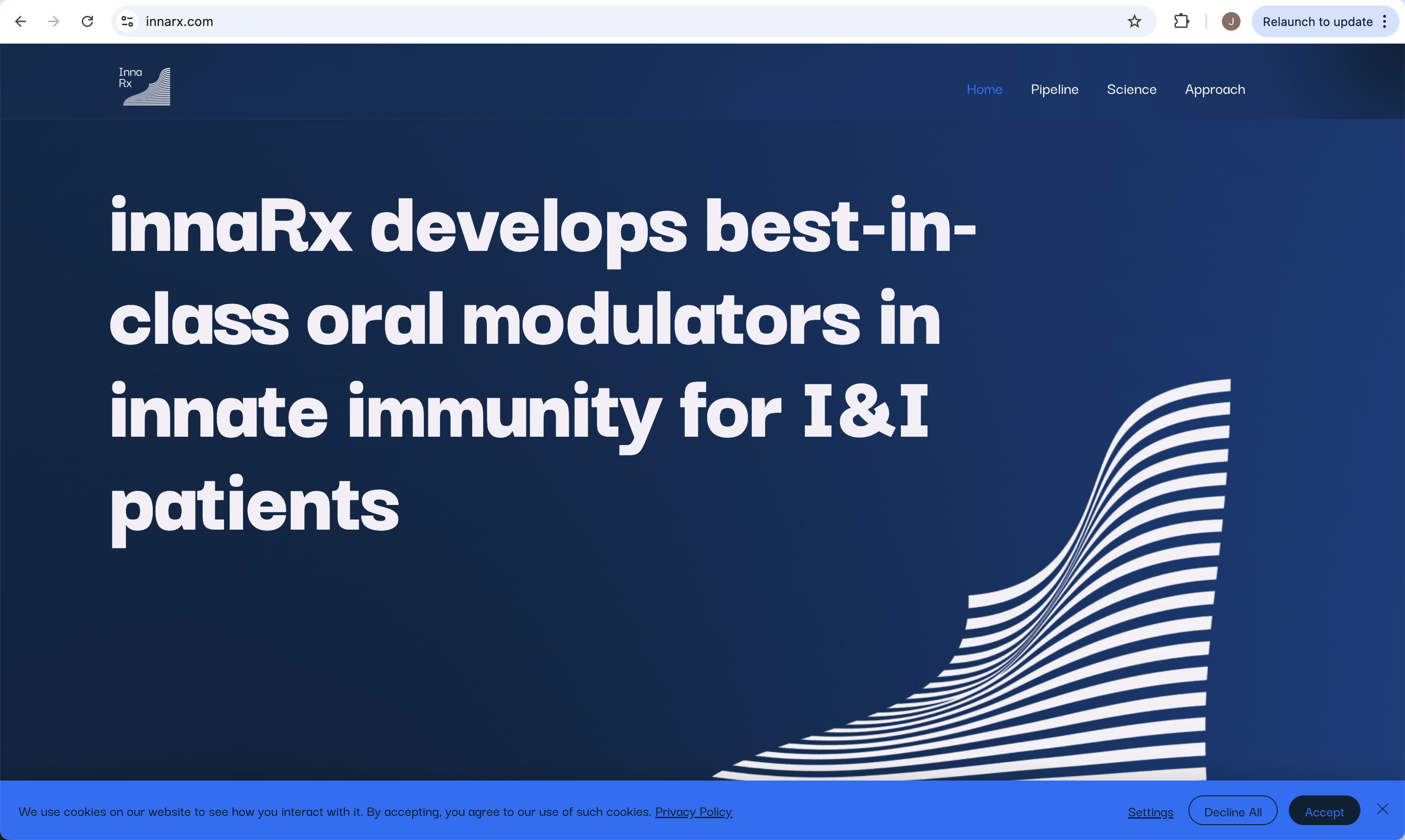
Website.
innarx.com — the live marketing site.
A quiet marketing surface that presents pipeline, science, and approach without noise. Navy dominates; the logo's striated waveform carries the right edge; type stays big, kerned, and calm. Built to be read by investors, regulators, and the occasional curious scientist — in that order.