VoutchWebsiteDesign
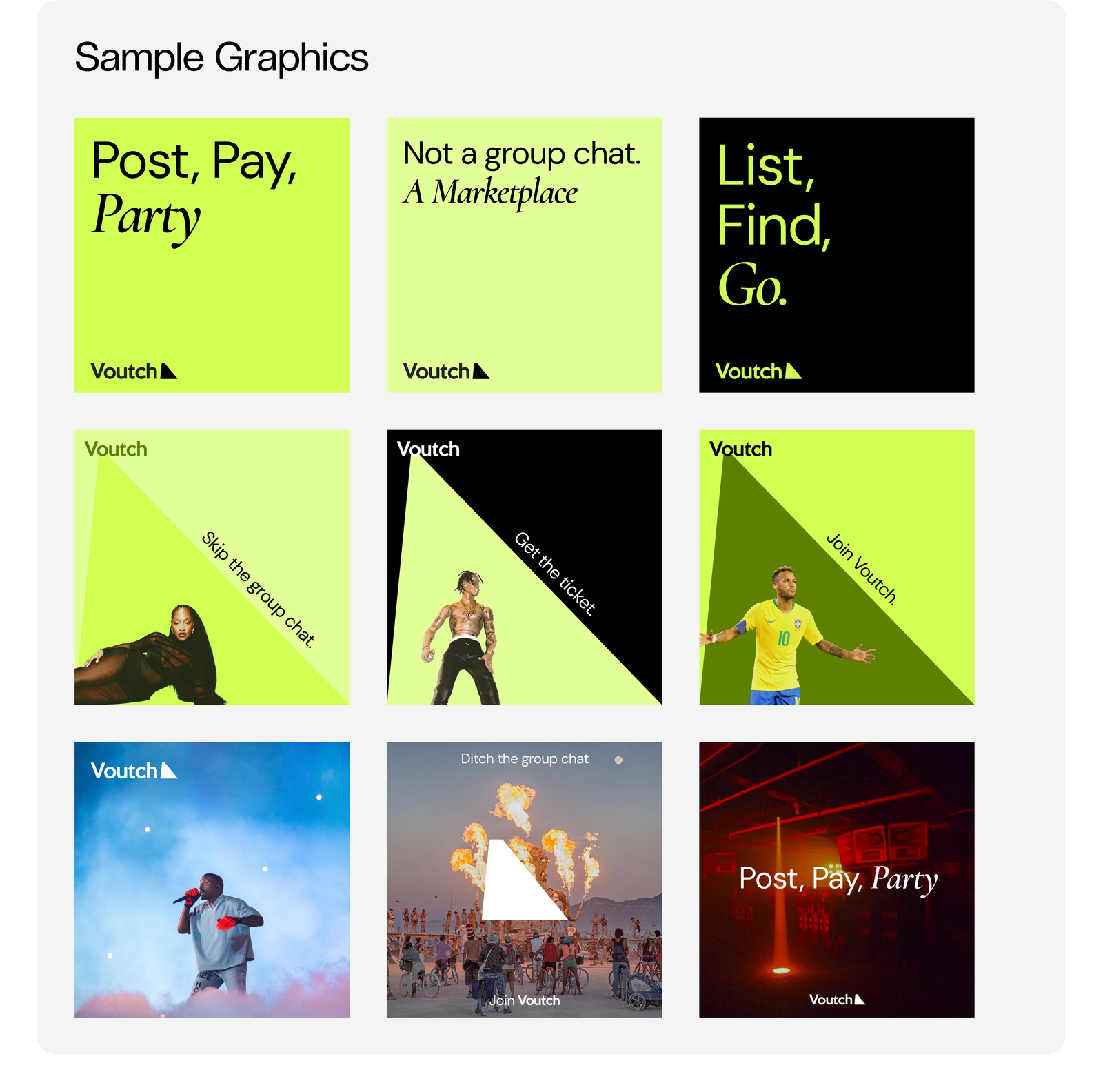
A peer-to-peer ticket marketplace for students — replacing messy group chats with one neon-bright, spam-free place to list, find, and pay.
- Category
- UI/UX, Web Design
- Year
- 2025
- Services
- Brand Identity, Web Design, Art Direction
- Client
- Voutch
Role
Founder & Principal Designer · No Turn on Red
Industry
Events / ticketing
By the numbers
Identity.
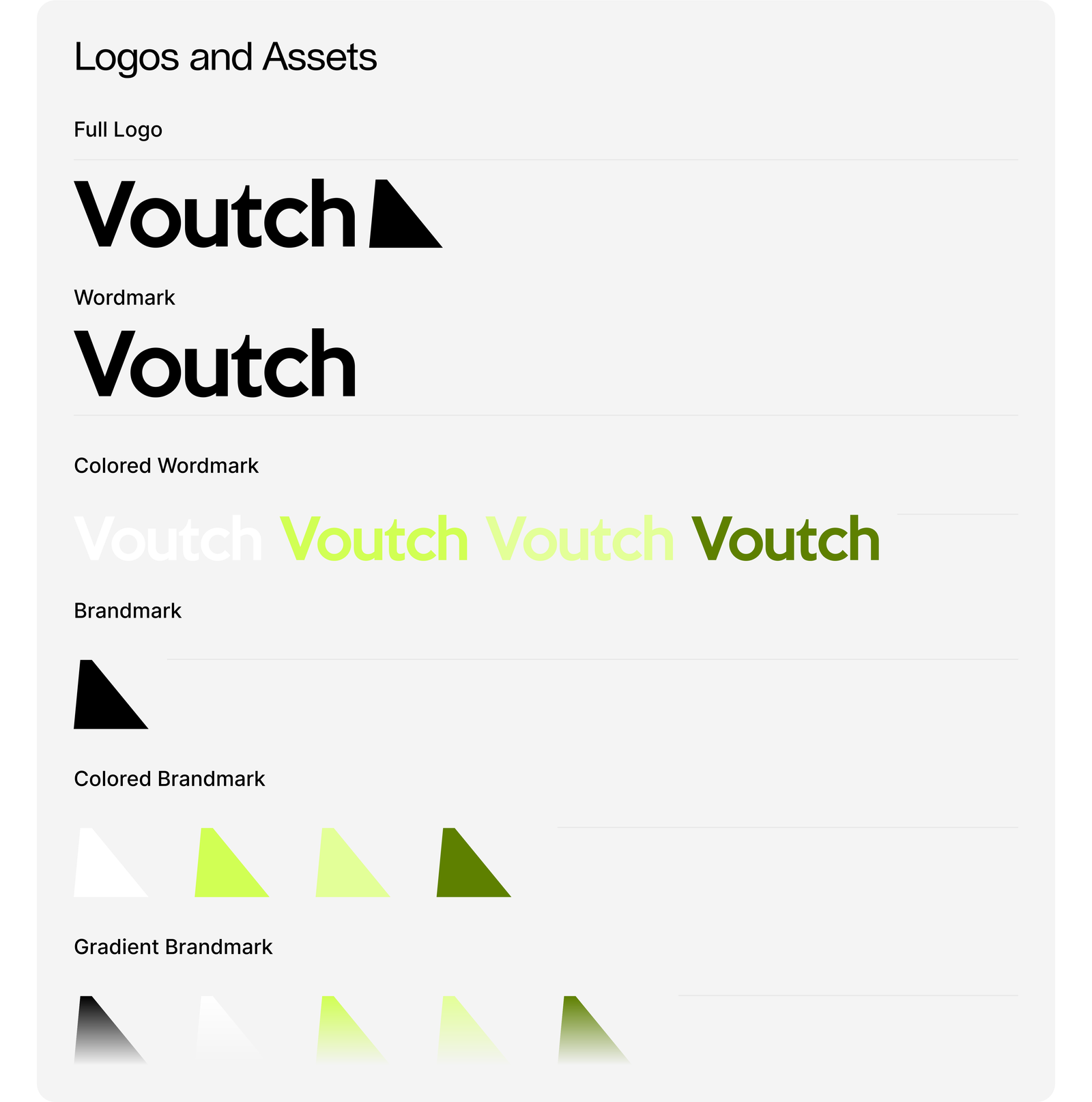
Not a group chat — a marketplace. The brand system leans into the energy of a night out: neon accents, a single assertive wordmark, and a triangular brandmark shaped like a paper ticket folded at the corner.
#D1FF54
Neon
Primary · CTAs · hero flood
#E4FF99
Light Neon
Surfaces · supporting tints
#5E8100
Dark Neon
Text on neon · depth
#000000
Black
Type · night-club contrast
#F5F5F5
Off-White
Neutral backgrounds
#575757
Grey
Secondary type · meta
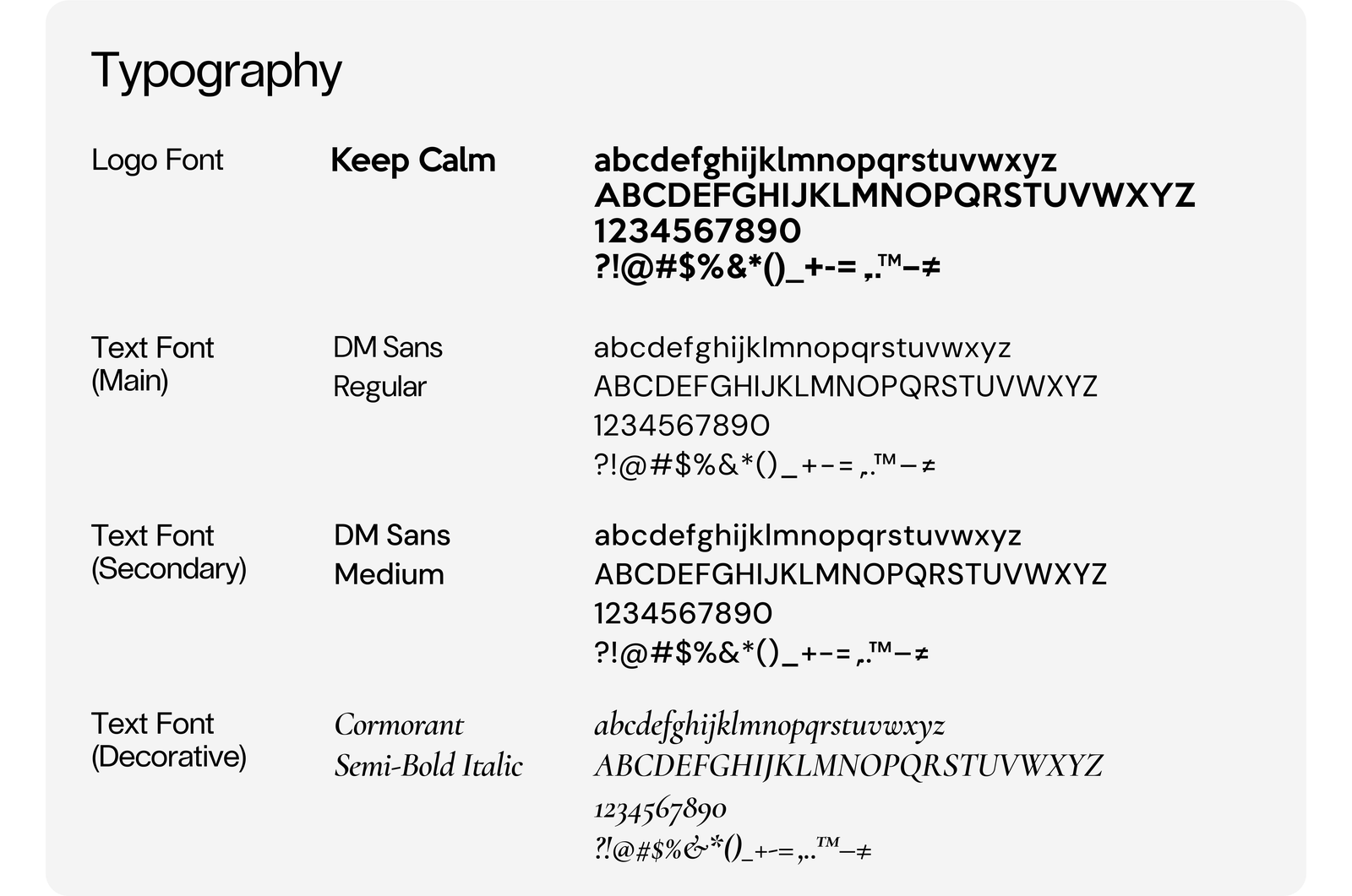
Logo
Keep Calm
Solid geometric sans for the wordmark — confident, unshakeable.
Body · UI
DM Sans
Neutral workhorse at Regular and Medium weights for all functional copy.
Decorative
Cormorant
Semi-Bold Italic — borrowed from editorial typography to soften the neon.
Website.
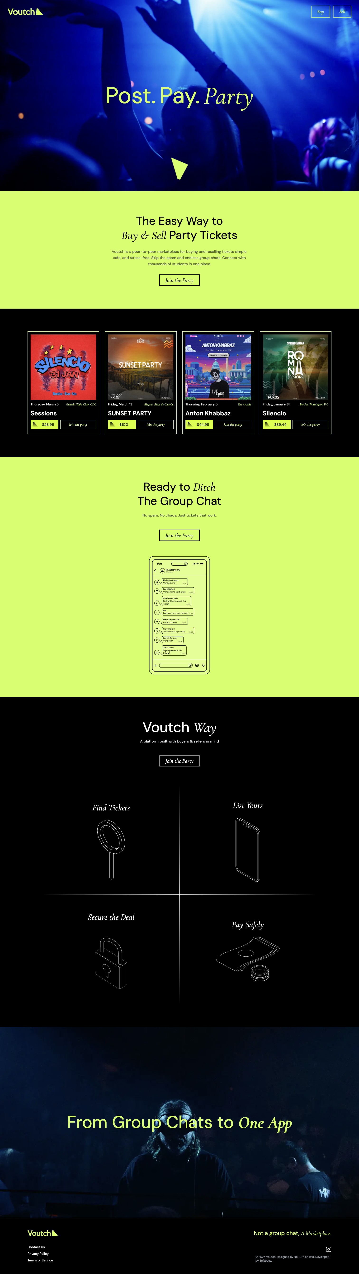

The core task: buy a resale ticket without the group-chat chaos — browse to e-ticket, compressed to four steps.
Conceptual user flow · core task, not shipped screens