An eyewear company started by two Mexican brothers sharing a passion for style and a desire to create high-quality, affordable sunglasses for anyone. As a dynamic new start-up, SHPAPI is on a mission to revolutionize the sunglasses industry. Making it easy for people to express their personal style and protect their eyes from the sun and club lights. We believe that sunglasses should reflect your personality and fit you perfectly. The various designs and colors of our glasses are meant to represent a timeless and classic accessory for anyone. The perfect combination of style, comfort, and affordability, for the day & night.
§Keywords
Brand keywords
Mexican
Passion
Style
Dynamic
Personalized
Outdoor
Club
Clean
Smooth
Visual direction
Unique
Stylish
Young money
Vacation
Cultural
Vibrant
Clean
Minimal
§Competitor analysis
Four reference brands set the corners of the eyewear positioning grid. Shpapi sits in a gap none of them occupy — warm, founder-led, day-into-night, Mexican rather than Parisian or Korean.
Type vibeLuxury, old money, gentlemen · sans + mono, cool
FacesMosvita 600 · Roboto Mono
Proves a small, focused type system can hold "premium". Borrowed: mono labels.
04 · Reference
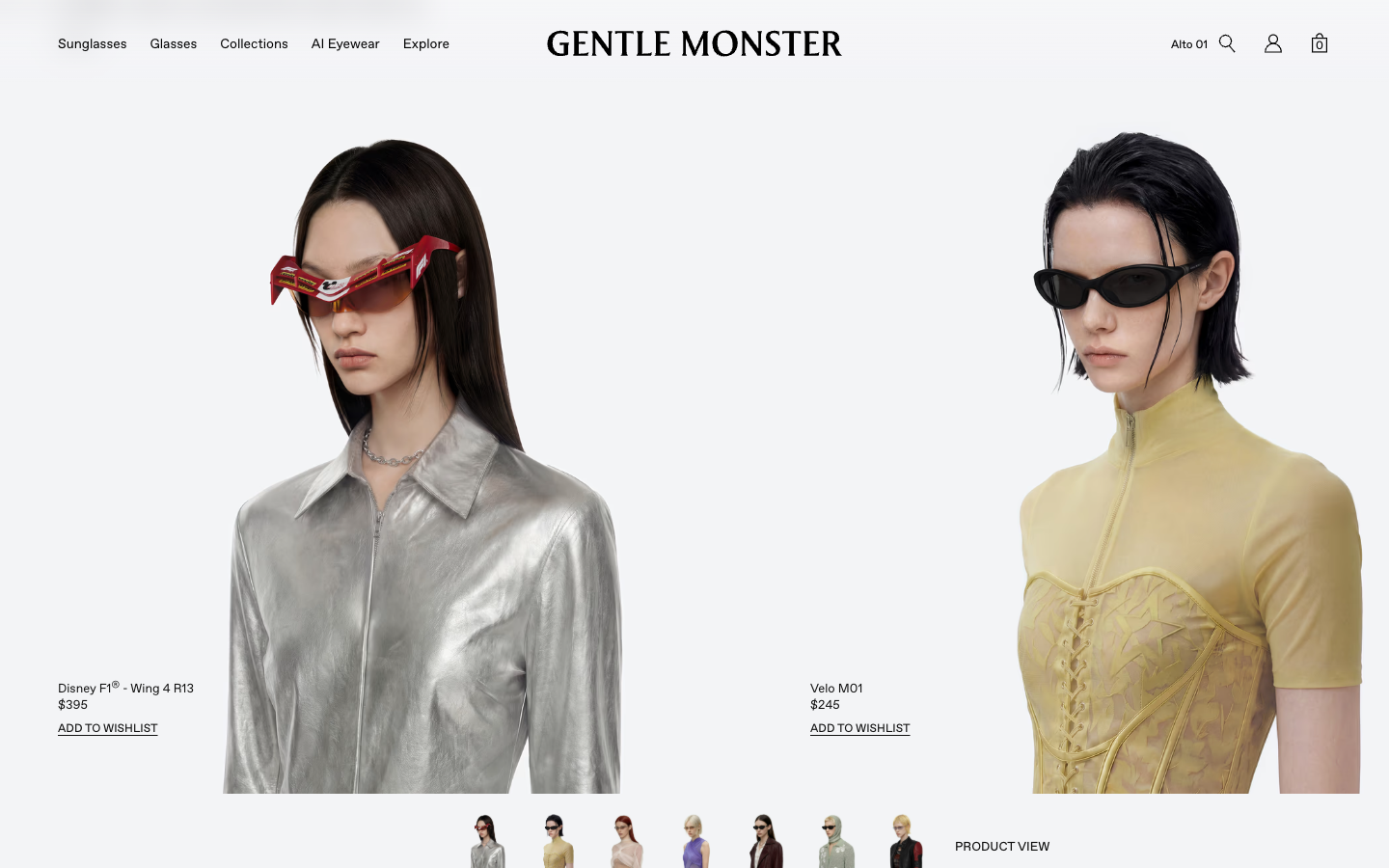
Gentle Monster
K-pop / surrealist retail · $300–500
VisualLots of real photo + render · clean nav, cool
Type vibeDynamic, y2k, colorful, vibrant · custom serif + sans
FacesgentleSans Regular · gentleMonster Serif
Maximalist, theatrical, retail-driven. The opposite pole to JMM. A ceiling, not a model.
§Why redesign · 4 drivers
Driver 01
A new vibe
The brand outgrew the night. The old site lived in a black room — abstract sun, club glow, dense serifs. The customer now travels in daylight, posts in golden hour, and wants a frame for the airport before the afterparty. The system needed to lighten, not soften — keep the edge, drop the night-only register.
Driver 02
A bigger brand
Year one shipped to a friends-and-family list. Year three sells $160 acetate with four named collaborators (Fundación Origen · NVC · Cas a Mi · Afronix). The site had to look partner-ready — a brand someone else would want to co-sign — not a dorm-room project hosted on a stock theme.
Driver 03
More to sell
The line stopped being one drop. Three collections now span beach, studio and travel — with a wardrobe of contexts attached. The IA had to make room for Collection I, II and III as first-class destinations, with their own world each, instead of a single undifferentiated shop list.
Driver 04
Product first
The old site sold a mood — a sun, a slogan, a manifesto. Nobody adds a mood to cart. The new site puts the frame at the center: editorial product photography, named SKUs in small caps, a flat $160 price with no badges or sale framing. The acetate does the talking; the manifesto moves to the footer.
Part 01
System.
Same brand, brighter daylight.
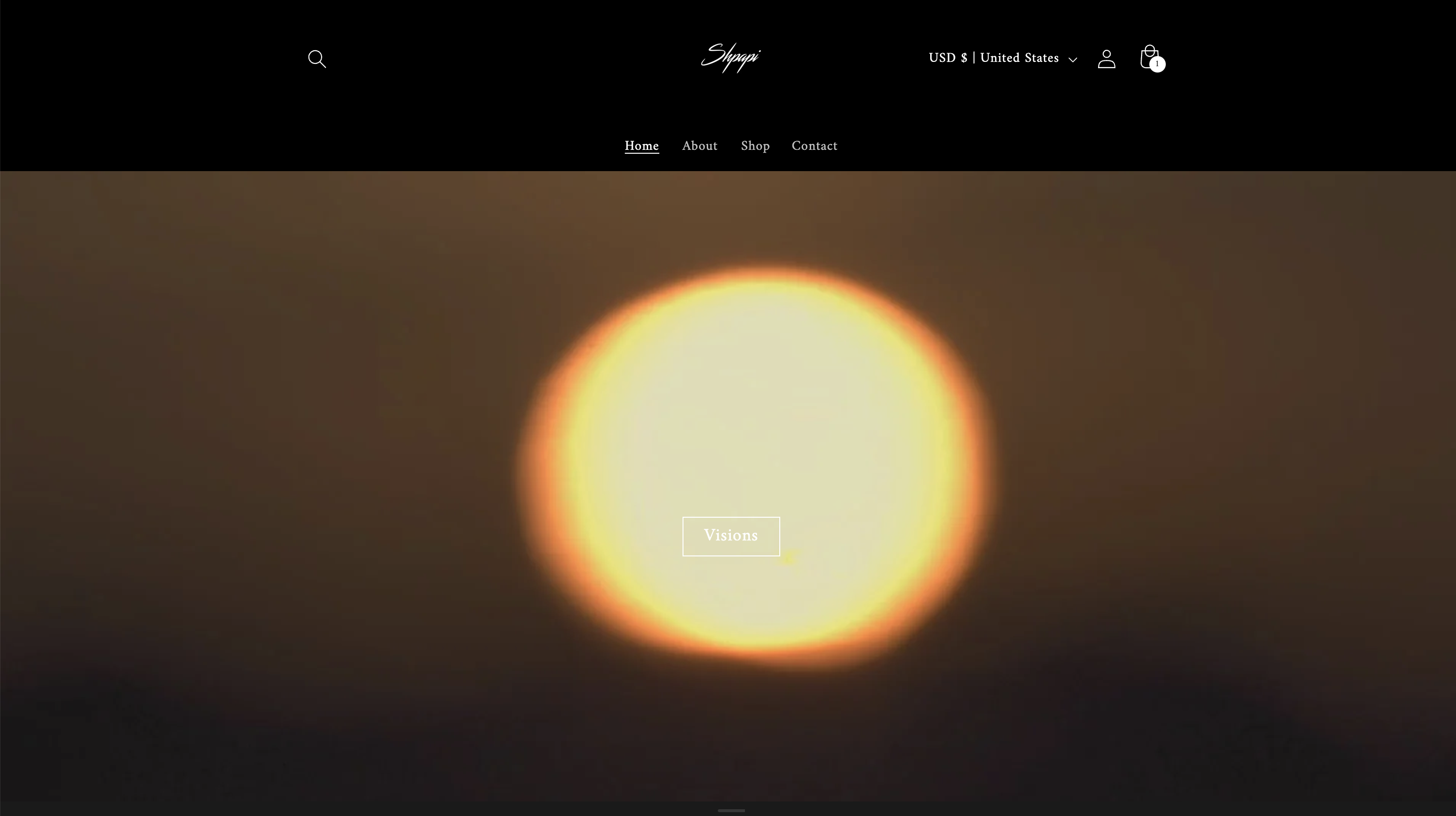
The original site sold the night — black background, white serif, a sun on the homepage, $65 frames stacked four-up against a club-room backdrop. The brand had outgrown it: prices doubled, the collection had a daytime range, the audience was no longer just the founders' friends. The redesign keeps the script logo and the founder voice, then changes everything around it — type, color, photography, pacing.
§ ATypography · before / after
Before
Display · centered serif
Cormorant
Body · default serif
Times
After
Display · headlines in small caps
Instrument Serif
Body · UI · navigation
Figtree
Replaced an all-serif setup (Cormorant + Times default) with a serif/sans pair. Instrument Serif handles the editorial moments in small caps, Figtree carries everything functional. Tied to driver 01 (vibe changing): an all-serif system reads as nightlife brand-wear; the new pair reads as a label with a daytime voice.
§ BColor · before / after
Before
#000000
Black
Primary surface
#FFFFFF
White
Type · accents
#1A1A1A
Charcoal
Card surfaces
After
#B0CCEC
Sky Blue
Day · light accent
#3D5077
Vision Navy
Type · headers · depth
#FBF5EB
Cream
Surface · warm light
#84614C
Camel
Secondary · sun-warmed
#3F352B
Espresso
Type depth · night
Inverted the system. Black surface became cream. White text became Vision Navy. Sky Blue came in as a daytime accent, Camel as the sun-warmed mid-tone, Espresso as the night counterweight. Tied to drivers 01 and 02: cream lets product photography breathe (a new vibe), and a five-token palette — cool to warm, day to night — is what a partner-ready brand can hand to collaborators (a bigger brand). Three flat values cannot.
Part 02
Website.
01Homepage hero
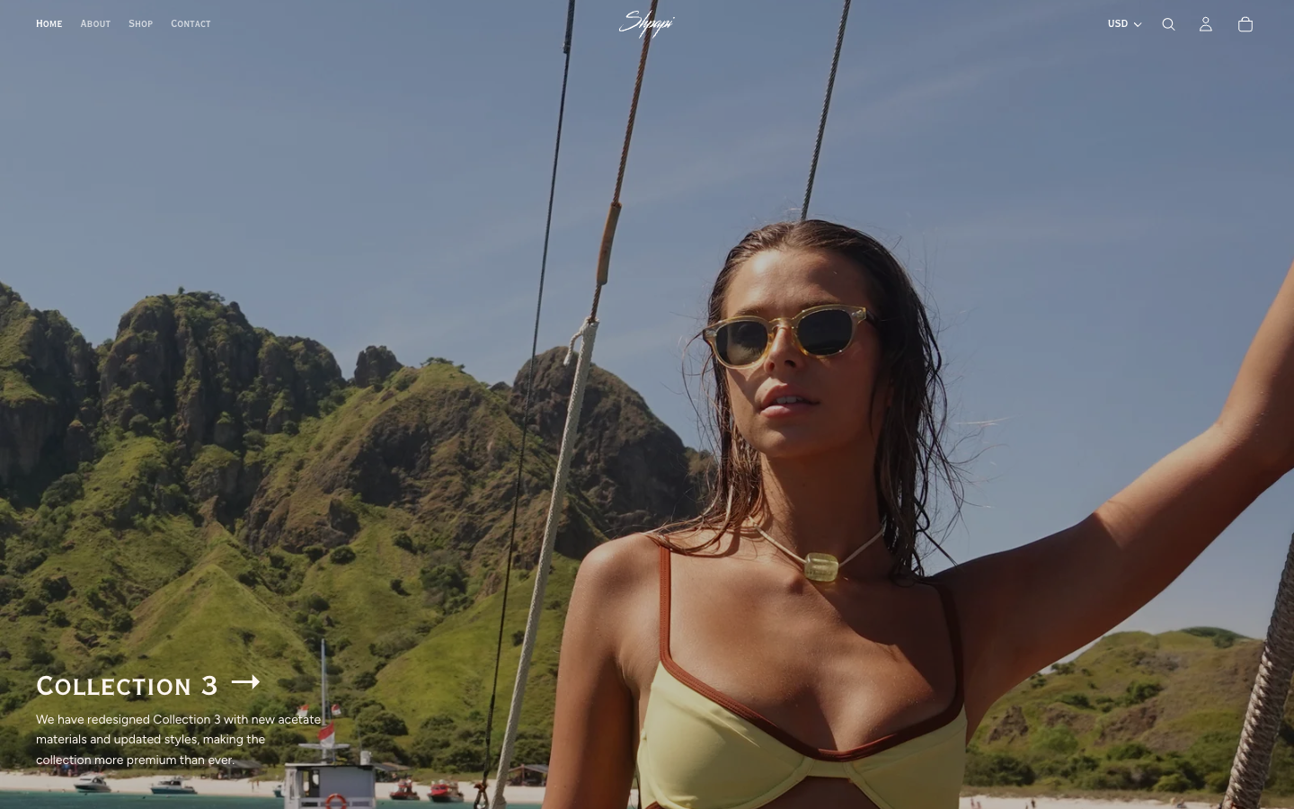
Before
After
Replaced a black-room sun visual ("Visions" CTA over an abstract sunset) with a full-bleed Komodo Bay campaign film. The hero now leads with a face, an environment, and a "Collection 3" caption — the first thing a visitor sees is a person wearing the product, not a mood.
Why · A new vibe + Product first
02Collection / best sellers
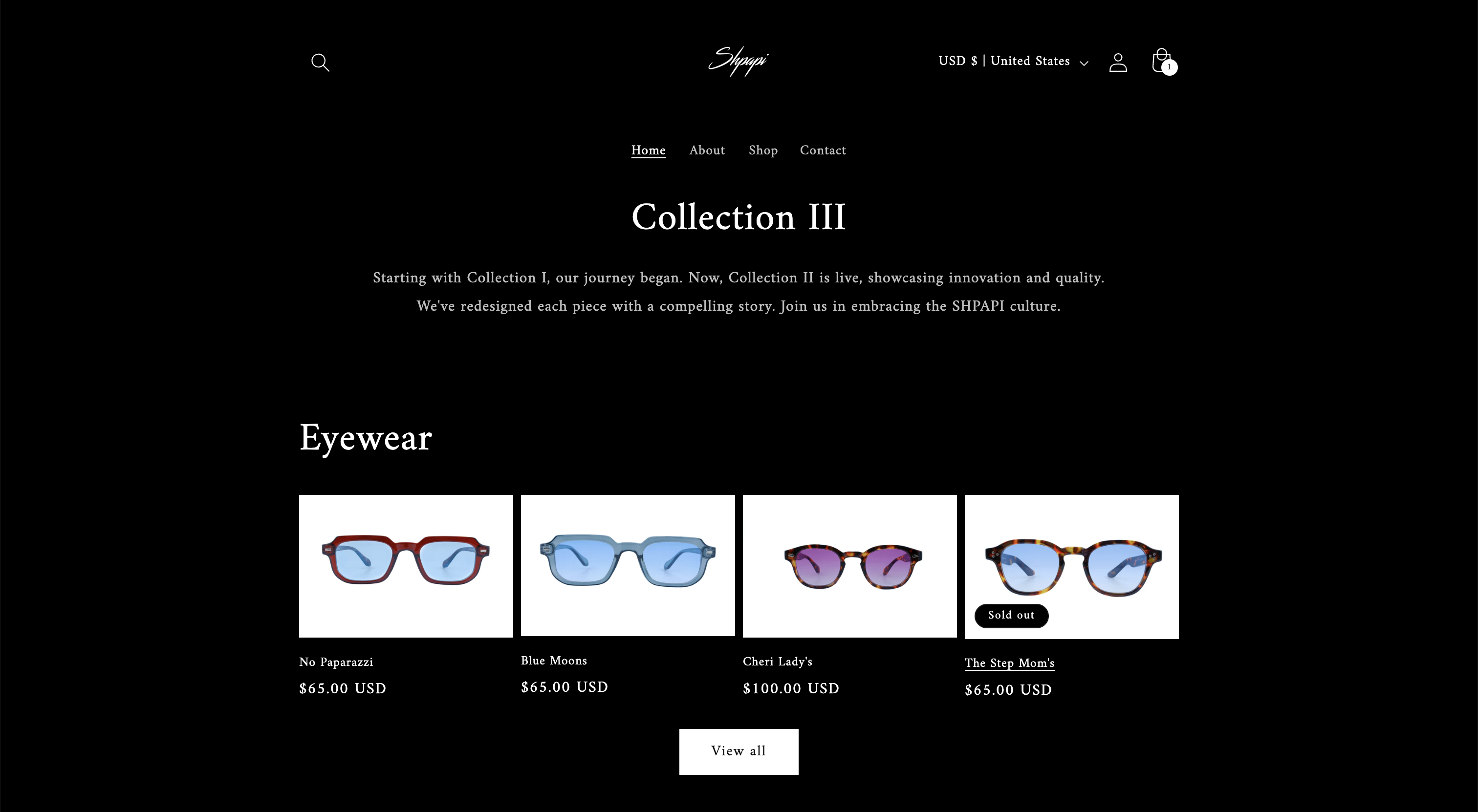
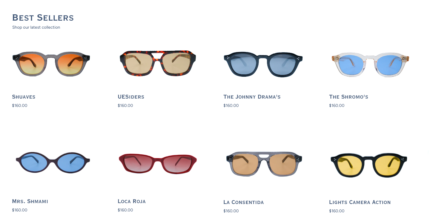
Before
After
The legacy "Collection III" page set 4 frames at $65 against black, with a centered serif manifesto on top. The new layout drops the manifesto, doubles the grid to 8 frames in two rows, and swaps the dark backdrop for cream — letting the acetate color do the marketing. Price moved from $65 to $160 with no badges or sale framing.
Why · A bigger brand + Product first
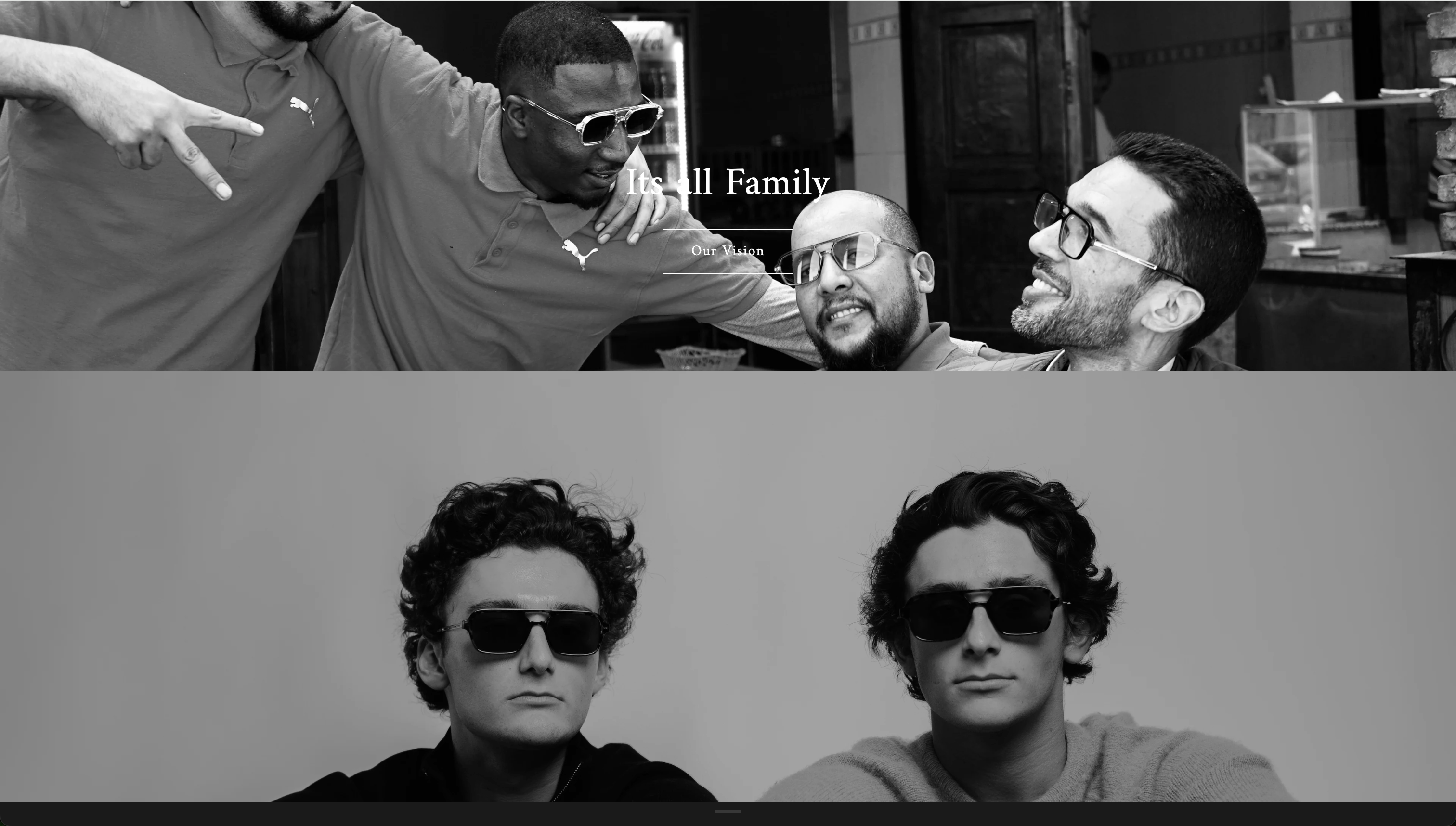
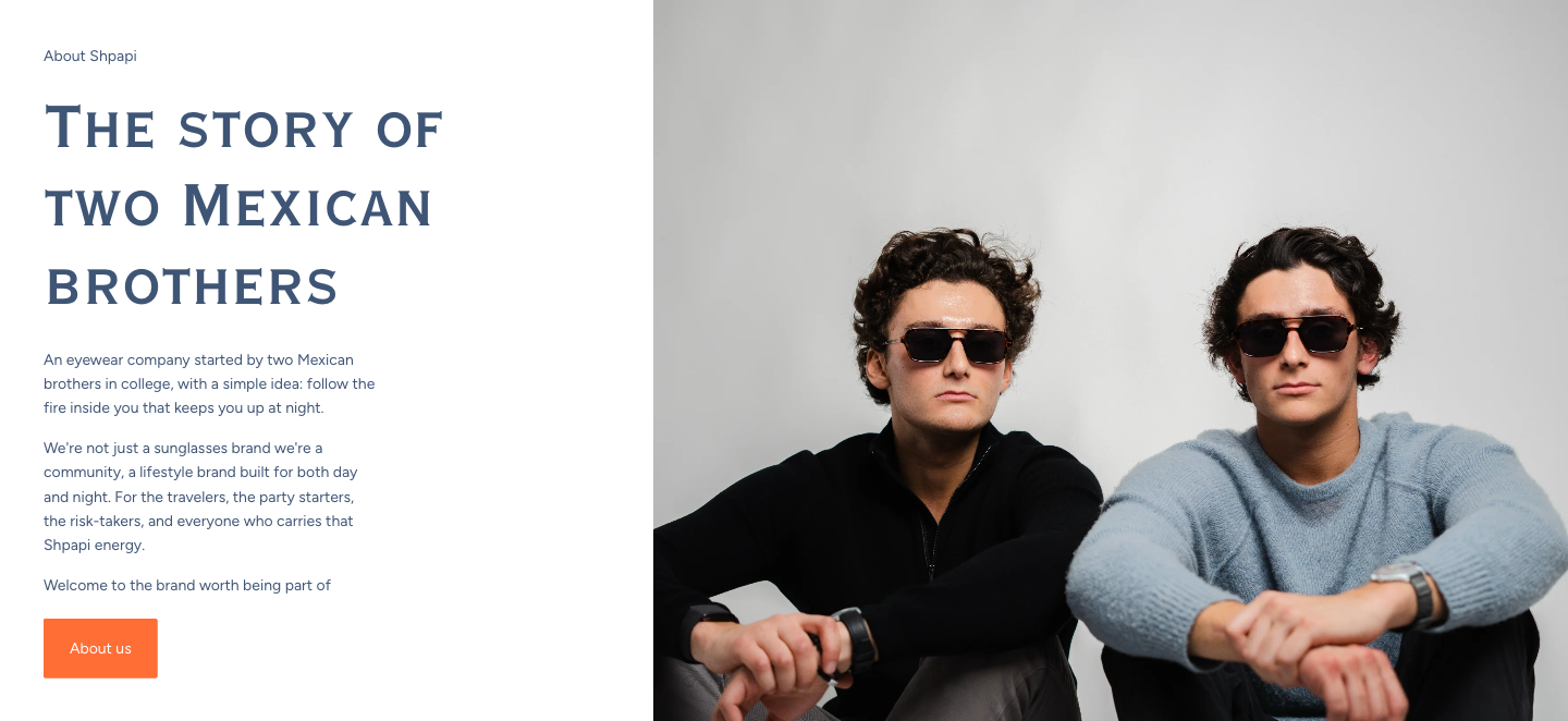
03Founder story
Before
After
The old "It's All Family" was a stacked pair of black-and-white founder shots with a single line of copy — the brothers as a mood. The new founder story sits inline on the homepage with three short paragraphs of voice ("We're not just a sunglasses brand…") and a single orange CTA. Below it, a Collaborations marquee proves the brand has stakeholders beyond the two of them.
Why · A bigger brand
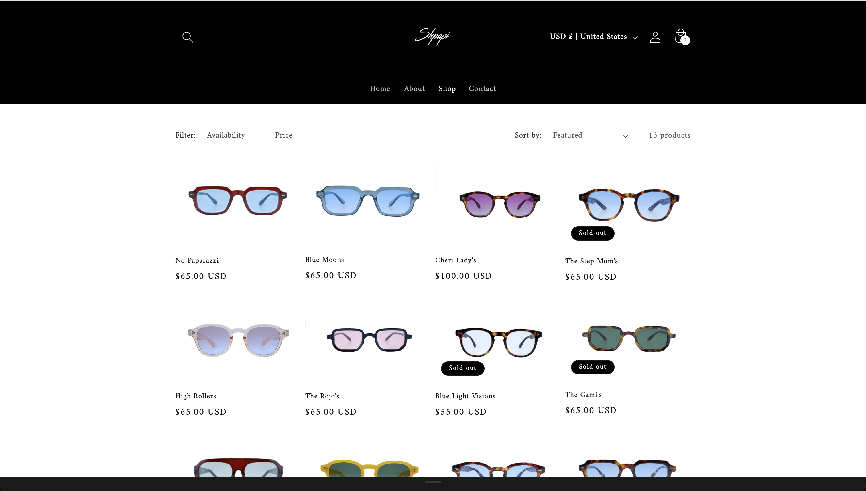
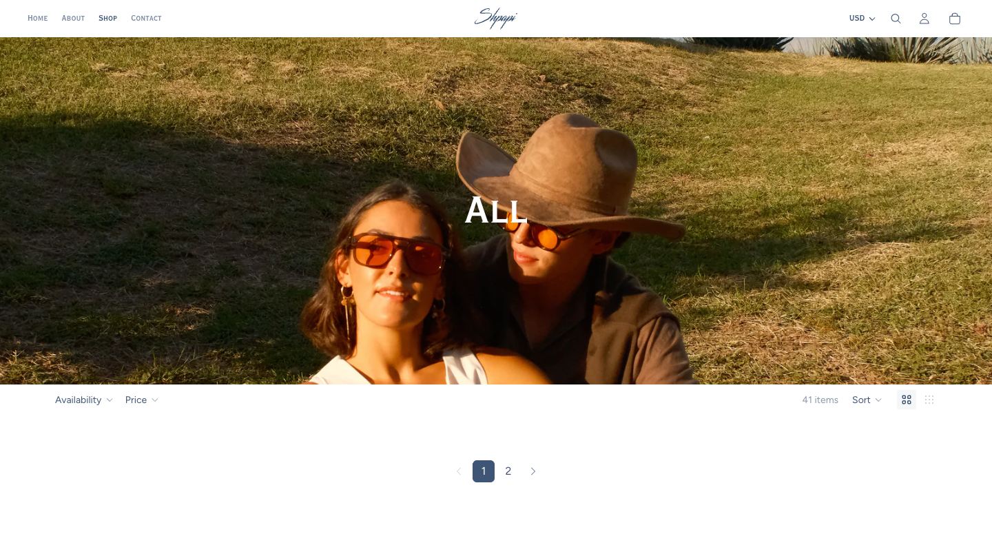
04Shop
Before
After
The old shop was a 4×3 product wall against black, sold by tile. The new shop opens with a golden-hour pair shot under a single navy "ALL" headline before the grid begins — the collection has a context now, not just a price. Filters tightened to Availability + Price + Sort, with 41 SKUs spanning three collections instead of one undifferentiated list.
Why · More to sell + Product first
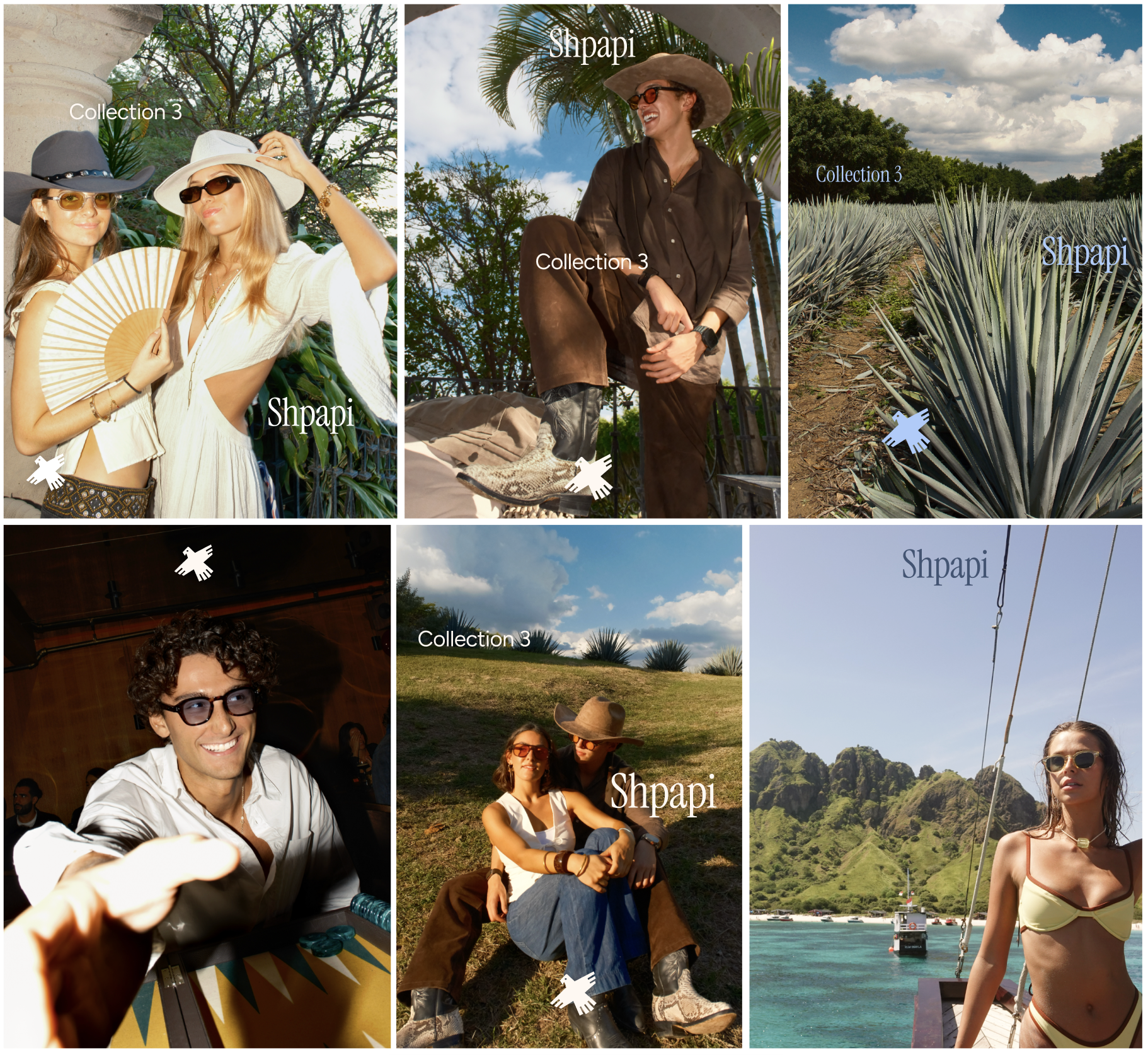
§Key visuals · Collection 3 campaign
Collection 3 campaign — six frames carrying the new system from sunrise to club night. The brief: one customer, one wardrobe, two states. Light blue sky, cream linen, camel leather, espresso shadow — the palette photographs itself.