Voutch Website Design
Brand Identity + Website · 2025 · 03/21Turning messy group-chat ticket resale into a neon marketplace for party tickets
- Client
- Voutch
- Industry
- Nightlife / ticket resale
- Service
- Brand identity + website
- Timeline
- 2025

Goal
Give party-goers one neon-bright, spam-free place to resell tickets — not the group chat.
Challenge
Safer than a group chat, but not corporate — and a resale flow built from scratch, not a template.
Outcome
A neon brand and a custom-built resale marketplace. Live at voutch.org.
We explored three logo directions — a spotlight, a ripping ticket, and a letter-T festival mark — then built the selected route into a full brand system: marks, colour, type, and a poster kit.
Three logo routes explored, one selected — then built into a full brand: marks, colour, type, and a poster kit.
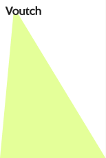
Route 1 — Spotlight

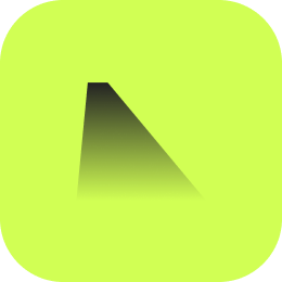
Spotlight, event, stage, highlight, focus.
Advantage
Strong visual scalability — dynamic, fun, clean, impressive.
VERDICT
SELECTED →
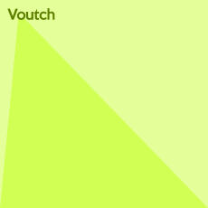
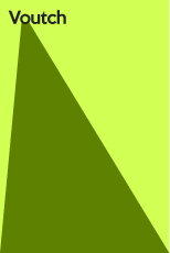
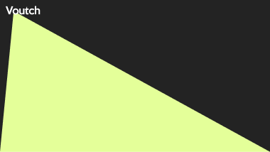
VARIATIONS
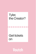
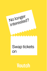
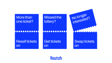
Route 2 — Ticket
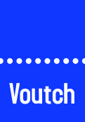
Ticket, modular, text — a ripping ticket.
Advantage
Fun, modular, creative, dynamic, info-focused.
VERDICT
NOT SELECTED
VARIATIONS
Route 3 — Letter T


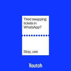
Letter T, plus sign — a flat festival mark.
Advantage
Colourful, fun, playful, attractive — dopamine.
VERDICT
NOT SELECTED
VARIATIONS

Logo — primary
FULL LOGO
WORDMARK
BRANDMARK
The primary logo is the wordmark plus the spotlight brandmark. Use it wherever space and contrast allow; drop to the brandmark alone where the wordmark won’t fit.
FORMATS
SVG · PNG · PDF · EPS
Logo — variations


Color — palette
Neon
#D1FF54 · Primary · CTAs · hero flood
Black
#000000 · Ink · night contrast
White
#FFFFFF · Ground
Light Neon
#E4FF99 · Surfaces · tints
Dark Neon
#5E8100 · Text on neon · depth
Off-White
#F5F5F5 · Neutral backgrounds
Grey
#575757 · Secondary type · meta
A neon-green system with night-out energy. One accent per surface, never two — neon on black, black on neon, or the daylight tints.
Typography
LOGO · KEEP CALM
Aa
MAIN · DM SANS
Aa
DECORATIVE · CORMORANT
Keep Calm is the logo face — used only for the wordmark. DM Sans (Regular + Medium) carries all UI, product and body copy. Cormorant Semi-Bold Italic is the decorative accent for editorial moments. Off-brand fonts are never substituted.
Typography — scale & hierarchy
Iconography & graphic elements
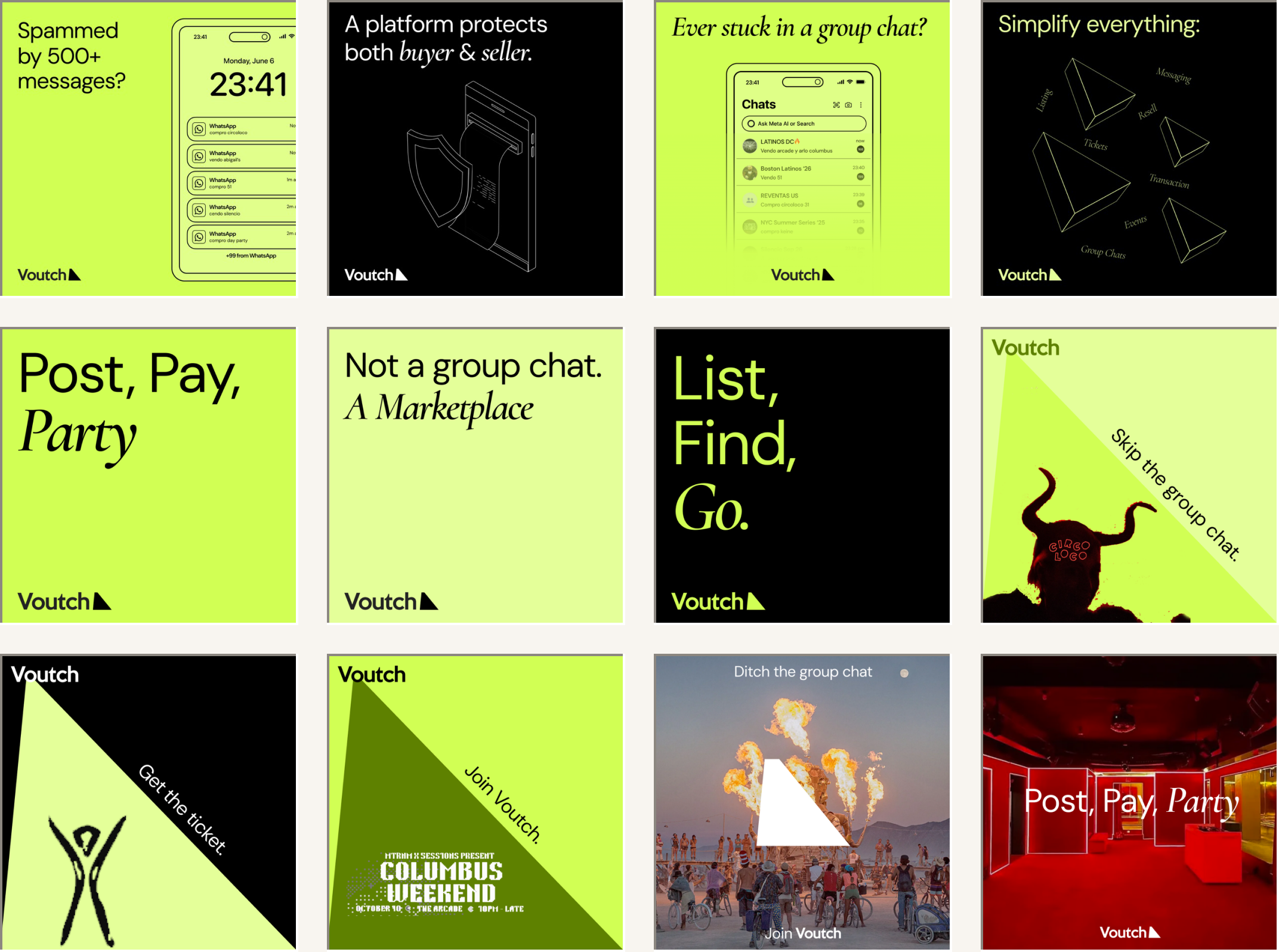
Poster and social templates — the system stretched across formats: bold type on neon or black, app-chat mockups, and full-bleed night-out photography, each signed off with the Voutch wordmark.
BRAND GUIDELINES — VOUTCH
A bespoke resale-flow architecture — designed and built, not dropped onto a marketplace template. 25+ screens carry a reseller from listing through to a buyer’s cart, checkout, and confirmation, across desktop and mobile.